New work again:

New work again:


hey guys long time no see!!,
well this is what ive worked up on my spare time!
if you have any suggestions please let me know [img]i/expressions/face-icon-small-smile.gif[/img]
unfortunately the size is too big for the forums =/ owell
I havent been in this thread for some time
this is my latest work, i havent been using PS much


PSP BG:

Wait, can you do backgrounds for your PSP?
Anyway i'll comment some.
Pochii: You need to work on the bg just experiment a bit. You also need a better quality render and may i suggest you size him up a bit, less legs and more upper body and head.
Noid: Those look really cool but i think they need som work. The first one is to empty on the right side and lacks background work. The second one looks weird with the space themed background, unless he is pounding on a glowing spaceship i think a background change would do the PSP bg some good.
Animepunk: The cube formations are cool and the text is decent but the rest of the background is poor quality and doesnt really fit with the cube formation. The render is also of bad quality, you need to find a better one.
Yes, you can. You can also Use it for the Internet and to watch TV. I [img]i/expressions/heart.gif[/img] my PSPOriginally posted by: PSJ
Wait, can you do backgrounds for your PSP?
NoID: Nice Ichigo sig. I like the red lightning, but it needs a little lighting. The Ironman sig, that doesn't look
as good. The bg and the render don't go together well.
For all you awesome people, it's just Phoenix. The numbers are just the amount of times people misspell it.
New work again. I'm proud of this one, unusual colors, blended well with Vegeta in my opinion, the text is one of my favourite things about it. Can you spot the text?


sorry man, i dont like it one bitOriginally posted by: AnimePunk
I havent been in this thread for some time
this is my latest work, i havent been using PS much

I spy with my little eye, PSJ's text..........I see it! Located on the right side in the middle [img]i/expressions/face-icon-small-tongue.gif[/img]Originally posted by: PSJ
New work again. I'm proud of this one, unusual colors, blended well with Vegeta in my opinion, the text is one of my favourite things about it. Can you spot the text?

Both your new works look great PSJ, but I like the Kingdom Hearts one better [img]i/expressions/face-icon-small-tongue.gif[/img]
For all you awesome people, it's just Phoenix. The numbers are just the amount of times people misspell it.
Here comes yet another new work, i've been busy with photoshop this past days. This one is the best out of the three newest in my opinion but since Terra gave me the amazing render i used i put his name in it.
EDIT:
OMG!!! I made a new one!!!

great work everybody, your all really improving
PSJ I love that vegeta sig, keep it up.
Anyway since I havent posted anything here in a long time I'll show you some of my newer work...
No c4d or downloaded brushes:
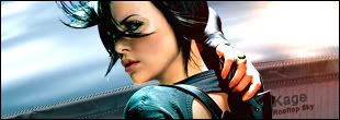
On this one I made every aspect, except for her, by hand with the pen tool and lots of other shit. Its supposed to be her on the rooftop of a building. No stock photos used for the bg or even for reference all made in photoshop.

Damn you were good before now you're even better. Cool works, keep it up man. It has been rather boring these past weeks without an occasional Kage work showing up.
Been doing some sigs since the forums went down, 3 to be exact.
DBZ works, been re-reading all of DBZ so expect some more of these.
Made a vertical sig thingy.
There is also a horizontal one.
Throw some comments at me.

DBZ fan ^_^
Yea, the manga is amazingly one of my favourites, it was the first manga i ever read and it has that hook, i can't get enough. Re'read it about 7 or 8 times by now i think, that's in 2 years i think.

i like your sigs, vertical sig is better than your horizontal one
just a little bit too bright
Your Goku/Goten one I can hardly see the render, maybe you brushed over it a bit too much?
Btw, nice stuff [img]i/expressions/face-icon-small-tongue.gif[/img]
I really like the Goten one PSJ. The color goes together very well with the render.
@Kage: That Aeon Flux one is nice. That bg makes here look more ninja-like [img]i/expressions/face-icon-small-tongue.gif[/img]
Well, I'm starting to learn different absract wallpapers techniques. Heres the first one I made. Not the best, but opinions are welcome:
http://img232.imageshack.us/img232/9301/signal3it.jpg
For all you awesome people, it's just Phoenix. The numbers are just the amount of times people misspell it.

Whoa, very nice Phoenix, just beautiful. Colors are just amazing. If you continue to better at this, it'll just be crazy. Keep going Phoenix, I might ask you make a new sig with another of my favorites characters. If you don't mind, that is. [img]i/expressions/face-icon-small-wink.gif[/img]
I have never drawn/edited sig images before... And I doubt I will in the future. I think I lack some faculties necessary for the job.