itachi your new jin sig looks pretty badass just need to fix up with adjustment layers maybe give him a tiny red color balance, but mostly contrast
itachi your new jin sig looks pretty badass just need to fix up with adjustment layers maybe give him a tiny red color balance, but mostly contrast
@kage really like the skater sig, something different
@PSJ nice brushing
@itachi like the jin...
new sig...
i know its too big for a sig, but wanted most of her body...
ok.....take out crappy render, find a sick cool render like a car or some kinda 3d render not 2d. cut out the middle part of the brushing and take the text but size it down. Put it all on one new sig and your the new current jesus.
Originally posted by: Kagemane_no_Jutsu
itachi your new jin sig looks pretty badass just need to fix up with adjustment layers maybe give him a tiny red color balance, but mostly contrast
i did do colour contrast :S guess it doesnt show much ill fix it later
I mean over jin silly [img]i/expressions/face-icon-small-tongue.gif[/img] Hes all not blended and not contrasted and im all itachi what the balls blend and contrast that shit and hes all thankyou kage.
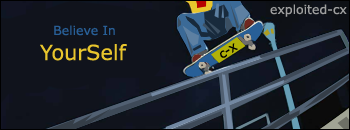
Heres a new skate thing I'ma beginner and this badass style so thats why it looks like garbage
Stock Image
heres how much cooler the style looks when done with experiance (not my work)

i did do it on jin...he was paler to begin with what makes you think exploited cx didnt trace it :S
Wha? We didnt draw it, it was all done in PS.
--' make a layer over the original img and use the brush tool to draw it...
change colour and removed lines
not quite, its actually a lot harder then that, but mine just looks like shit cause I be noobin.
@DeckZ: You should've made that as a wallpaper. It looks really great! Love the brushing job you did on it. The render seems fine to me as well.
@Kage: I'm assuming you tried to vector that? Its actually not that bad for your first try! The shadow came out nicely, just like the stock image.
This fantastic Sousuke sig was made by the one and only Lucifus! Thanks man!
meh the renders nice but it has so much more potential 3d render > 2d renders anyday of the week. So unless you want to make something specifically designed for an anime character you should always try to use 3d renders. Or atleast digital colored renders like manga covers or something.
Man that style is fugly Kagemane. Why do you want to do shit like that?
Also, "ok.....take out crappy render, find a sick cool render like a car or some kinda 3d render not 2d. cut out the middle part of the brushing and take the text but size it down. Put it all on one new sig and your the new current jesus."
lol why not tell him to just make a new sig if he's gonna change all that? [img]i/expressions/face-icon-small-tongue.gif[/img] I think Deckz new sig is awesome as it is.
2D > 3D
Kage, your try is alot cooler than the exploited-cx one. Yours look a bit artistic the other one looks like shit.
New work. It's Auel again!!

I can tell! Do you ever get tired of making great sigs? I didnt think so....Originally posted by: anime050
Felt like it.
Well here's my 2nd attempt at the vector art style.
Stock
I still don't understand what you see in that vector garbage. It looks like something I threw together in Paint when I was 6. [img]i/expressions/face-icon-small-tongue.gif[/img]
Because its actually creating something, its not just take someone elses work and put a background behind it. And its different. I also like doing phot-manip sigs like this one I just made:

You're still using a stock though. [img]i/expressions/face-icon-small-tongue.gif[/img]Originally posted by: Kagemane_no_Jutsu
Because its actually creating something, its not just take someone elses work and put a background behind it.
Point being that it's still not created from scratch since you have a source.
Also, it still looks like crap. Although I'm sure you are doing a good job. That shit is beyond me.
lol i agree vector is ugly sorry kage --'
EDIT: what is ur recent obsession with skateboarding Oo'
what you guys think :S was trying to make a pop out one but the render was messed up

In my mind vector art is the same thing as lookin at a picture and drawing it freehand where as just making backgrounds is like tracing the picture. And once I get good enough I can start making amazing vector art like this:
http://www.deviantart.com/view/11548242/