@Terra: Great sigs you have there man!
@a50: Great stuff as usual dude!
@Terra: Great sigs you have there man!
@a50: Great stuff as usual dude!
This fantastic Sousuke sig was made by the one and only Lucifus! Thanks man!
Sick Destiny sigs Terra, but I think you should have made them more different by swapping where the person was and the design and changing the design a bit.
Very nice sigs everyone.
New Kimi sig I did.

It's dangerous to go alone. Take Nep.
Your getting much better Alhuin, start using some special brushing mixed in too. Go to Deviantart.com then scroll down to the resources section then go to brushes. Download as many as you can there are some great brush packs out there. You should always download more and more brushes so your stuff doesnt start to look too repeptitive.
My fav brushes:
http://www.deviantart.com/deviation/19807319/
http://www.deviantart.com/deviation/19518668/
http://www.deviantart.com/view/15847830/
http://www.deviantart.com/view/19912499/
http://www.deviantart.com/deviation/19911889/
http://www.deviantart.com/deviation/19912499/
And here's a new sig....

So, who wants to give me some renders to work with ; ).


not me [img]i/expressions/face-icon-small-tongue.gif[/img]
anywho nice sigs; speaking of which, what pic do you guys think I should use(Im sort of leaning towards the first one):
This
or
This
yes I know they're big, but I dont feel like changing the size now
R.I.P Captain America.
Well, I've been doing alot of sigs lately, and I've been thinking of them all as failures.
These are some of them.
bleach spoiler
Just tell me what you think.
@Kage: Thanks. I just recently updated to CS2 so I did go out and get a lot of new brushes. Thanks for the reccomendations.
@a50: Both of those sigs are awesome. I especially like the Ichigo one. Might I ask where you got the render for that?
Here's another new sig I just finished. I'm on a roll!

It's dangerous to go alone. Take Nep.


@a50: They're both failures. [img]i/expressions/face-icon-small-tongue.gif[/img] Seriously though, W.T.F. is that on the right side of the second sig?
@alhuin: That sig is great! Though you used that same stripey thingy on that other one as well, and that's not cool. [img]i/expressions/face-icon-small-sad.gif[/img]
Actually, I used diagonal "scanlines" on the other one, so they aren't exactly the same. I also actually used that same font too. And the bar... [img]i/expressions/face-icon-small-tongue.gif[/img] But, ahh... I'm just using the techniques I recently learned, so sorry if it seems repetitive. I did experiment with "special brushing" though, so that helps. And I (personally) think the render makes up for it. Anyways... I need to go out and get some more fonts... to be used in sigs... but I don't know a good place to download them.
It's dangerous to go alone. Take Nep.
Mmm, imo, I think both of my sigs lack something. A certain 'thing' to wow someone.
To me, they look like garbage.
EDIT: Can anyone, please point out anything that they DON'T like about those sigs.
That way I have something to focus on improving.


www.dafont.comOriginally posted by: Alhuin
Actually, I used diagonal "scanlines" on the other one, so they aren't exactly the same. I also actually used that same font too. And the bar... [img][/img] But, ahh... I'm just using the techniques I recently learned, so sorry if it seems repetitive. I did experiment with "special brushing" though, so that helps. And I (personally) think the render makes up for it. Anyways... I need to go out and get some more fonts... to be used in sigs... but I don't know a good place to download them.
As for this "special brushing," I would like to learn more about this.
There we go, I'm done with my little Seed Festival.. having covered all my favorite characters. The last one up is Rey!
I like it more than I liked my Shani, but well, yellow ain't my favorite color. But it fitted the sig better than making it white. (it's either white or yellow for Rey)
I also edited Shani slightly, he is more transparent now and has more shadows (a vast improvement in my opinion).
All on a row!

Beautiful terra


Hey wait a minute, Rey isnt dead/injured [img]i/expressions/face-icon-small-tongue.gif[/img]
R.I.P Captain America.
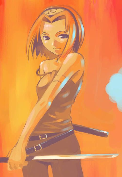
Sakura sig
The pic I used of her is the hottest Sakura pic I've seen:


The colors burn my eyes!


nice sig, and the colors dont burn my eyes....that much
anywho which one of these two sigs looks better.
or
Im seriously thinking about doing it over, b/c the designs weren't originally what I wanted
R.I.P Captain America.
Try using my tutorial and use colors that match the render. Or put the render under the color balance layer. And download all those brushes I posted.
New car sig
