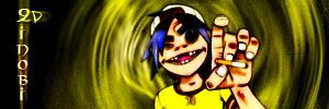
you are getting better z :P, and i actually like the emptiness on the rightOriginally Posted by Zinobi


you are getting better z :P, and i actually like the emptiness on the right


Random practice with the smudge tool.


1. I don't know what that white line is on the left. It's a little distracting.
2. Style of background doesn't fit style of render well.
3. I like the colors.
just made this one of hisagi

creation,
that is a beautiful work. try making the face more 3d/epic in front of the graffiti. Your font could be clearer, and blended a bit better.
zinobi,
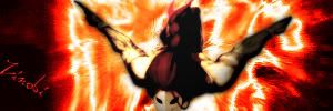
nice effects coming off the figures. i like them.
but,
at the same time three is too much open space.
not enough substance, no matter what it be.
goddamn it's sweet to see oldbie F-fire postin sick fanarts@!
Humans are different from animals. We must die for a reason. Now is the time for us to regulate ourselves and reclaim our dignity. The one who holds endless potential and displays his strength and kindness to the world. Only mankind has God, a power that allows us to go above and beyond what we are now, a God that we call "possibility".

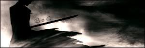
BoC, I love your new sig! Maybe I'm way late to be commenting on it, but it's one of my most favourites of yours so far. It's simple, and well composed, and I think it's gorgeous.
Thanks, KitKat. It's actually just a recolored version of one I did a LONG time ago:
Double color balance FTW!


yea BoC it would be really badass if you lost that text.

Yeah, I'm with Kage. I don't really know how you could fix it though...
Yesterday, I finally started toying around with making my own C4Ds. I've only saved like four, since rendering them takes forever, but I used one of my favorites to make this wallpaper:
http://i78.photobucket.com/albums/j1...SPLINENEW3.png
v4
I love this wallpaper. I'm absolutely surprised by the turn-out - it took me three hours after all.
master_me + dA = <3

nicely done master_me
new one

I'm official.

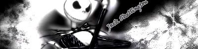
Who is that, Dante?
R.I.P Captain America.
yes it is dante hard to tell though but does it look good? i think thats the question =P
I'm official.

Looks to me like you did a poor rendering job.
yes i did T_T not my fault though i currently dont have a mouse...im using a finger pad. the mous i did have would skip all over the place then go dance in one of the corners >.>
edit: so people really dont make sigs now or what?
well my internet was out for awhile so i made a batch and now remembered about them =P

Last edited by Zinobi; Thu, 08-31-2006 at 01:32 AM.
I'm official.
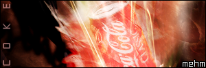
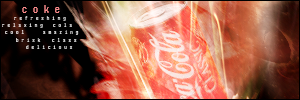
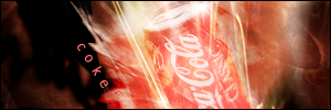
Two versions, both with different text. I feel that they both have their upsides, but, ehhh. I dunno. This is my new favorite sig - I messed around with fractals, smudging, smooth brushing, c4d, and also rendered that coke can. ...yeah, it was an easy render.
By the way, BoC, are you known as "mvp_pape_sow" at gamerenders?
master_me + dA = <3
I don't like the second version. The text is kinda weirdly spaced and hard to read.
With school starting I haven't really had time for PS, but now that there is a 3 day weekend I might make something.
...that's the point. It goes for a nice effect, at least I think. I do want to take it out, but, it's really the only thing I've found that works.I don't like the second version. The text is kinda weirdly spaced and hard to read.
master_me + dA = <3
Haha yes I am. Is this sig inspired by the legendary coke can render? IIRC, I was the first one to insult the render and after that it just became a laughingstock.
In part, yeah. It's also for a themed graphics contest on another board, where you have to choose a random product and sig it.
Updated it so the text sucks less. Can't believe I missed that little spot, it's perfect for text.
master_me + dA = <3
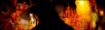
Since Zinobi is complaining about the lack of new sigs recently...
I'll be the first to admit that this isn't my greatest work.
 Posting Permissions


 Reply With Quote