Hmm, what I might try to do is overlay some stock photo of fire over that portion of the body so the green part is partially hidden. Not sure it would work, but I'll give it a shot.


Hmm, what I might try to do is overlay some stock photo of fire over that portion of the body so the green part is partially hidden. Not sure it would work, but I'll give it a shot.
master_me + dA = <3

Alright
well just did this nothin special

I'm official.


Or you can make a hue/saturation adjustment layer and do some tweaking with the parts that are green.

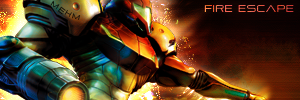
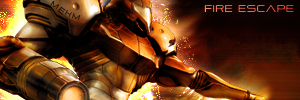
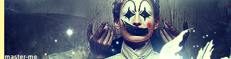
Here's a couple version's of my latest signature :
1.
2.
I'm not sure there good or not, comments are appreciated.


@Koko
They're both cool, but I like the first one more. The second has a bit too much light. I would take the first version and shift the guy over to the left a little bit. A general rule of design is to keep things off-center.
"Samsonlonghair - The Defender of the Oppressed And Shunned!" -Kraco
Tried thatOriginally Posted by Board of Command
(not in that first one, I tried it after making the third one)
EDIT:
See, without any touches, this is the render:
Too much depth (at least imo) and overcolored. I originally wanted to just flatten in it and make it look a little more consumed by flames, but after finishing the entire sig, I realized it was just not going to work.
EDIT2:
Tried two new things:
Last edited by master_me; Thu, 08-10-2006 at 08:51 AM.
master_me + dA = <3

master_me: Cool sig, I like the first version more. The BG looks better.
You didn't by any chance colorize the entire render? Oh well, looks good.
Close
I duplicated the render, colorized the duplicate, and set it to color. Gave it a bit more depth.
master_me + dA = <3


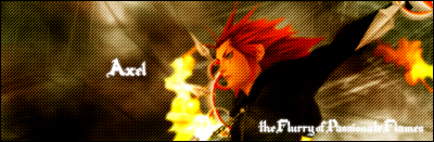
Saw the render and had to use it, bout 7 minutes of work, too bad I cant use it here because i'm not gonna resize it.
master_me: the 1st one after the edit looks much better IMO
KoKo37: i don't like the lightness of #2 so #1 is winnar.

nice bg and lighting, text....not so much.
got a new one

I'm official.
It was requested at another forum..I kinda like it
hating the dots pattern
Yeah me too.
And I can barely read the text due to a combination of poor location and font choice.
....................
Last edited by Thi3f; Wed, 01-09-2019 at 05:03 PM.
hmm, yhea I do use those dots on EVERYTHING, I should probaly stop that <_<. And yhea I dont really like the text but as long as the person who requested it likes it i'm aight with that.
new one no sure how good it is...im about half asleep right now...

I'm official.


Too much text, and it doesn't actually even make sense; "Why do no one..." No one what? And "Has the right you kill" Uhhuh... And words coming out of people's mouths is a really tricky effect to try, and I'd estimate it's prone to fail as an artistic effect most of the time. And well, as a whole it indeed looks like you were half asleeps when you made that. It's not a very strong sig, to be frank.
I don't really like that one Zinobi, the text isn't good, the background is pretty plain, and the brushing is bad.
Anyways, I made a couple more signatures, not sure if there any good :

 Posting Permissions

 Reply With Quote