I like the background design in your wallpapers Deadfire, the only thing i have to comment on is that it needs more variation. The colors work well, especially in the second one but you need to do something with it so it gets a little variation.


I like the background design in your wallpapers Deadfire, the only thing i have to comment on is that it needs more variation. The colors work well, especially in the second one but you need to do something with it so it gets a little variation.

wow the second one i so cuuuuuuuuuuuute!!!!!!!!!Originally Posted by Deadfire


DF:
Same general idea as what PSJ said. The background looks like a repeating pattern of colors, even though it's not. You need some "direction" or "focus" such as parts that fade to black.
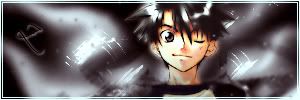
I finally got a new look on GW. Tell me what you think please, i have doubts about the sig....

background is kind of flat and not all too interesting
also the render just looks like you placed it there over the background,which in turn doesnt work out for the sig :/
I'm official.
After looking at my sig several times for several minutes i have to say that i disagree with you.
The background is maybe a bit flat but i didn't go for a flashy background this time. I just wanted a nice, easy on the eyes background. It makes it possible to focus on the render a bit more.
As for the render, i also thought it looked like i placed it right on top but after a while that feeling changes.
Thanks for the inputs though.

PSJ, I like the bg very much. Clean, yet colourful, gives a nice sweeping wind/sunbeams feel. The imbalance in the sig I think is in the lighting. Your render is lit from a source somewhere above and slightly to the left. The main light source in your bg is from the top right corner. It might be less noticeable if you could get rid of the very bright spots on his face.
Very true. Thanks for the input KitKat. I have always had trouble with lighting in my sigs.

Don't know if I posted these before, but whatever : D.

not a big fan of the squares around the text on the first one but other than that...theyre awesome
new one:
Last edited by Zinobi; Sat, 02-10-2007 at 02:17 AM.
I'm official.

Sig to keep my skill sharpened. This is still a work in progress. Can you all give me some pointers?Should have gotten a better render to work with though.

If I'm not mistaken, is that one of Metal CX's brushes?
master_me + dA = <3


does anyone have a wallpaper of gundam seed destiny of strike freedom's cockpit ?? i've been looking for a good wallpaper of that
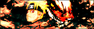
Haven't made anything in a while, so here's one in preparation for the end-of-fillers.

Last edited by Board of Command; Sun, 02-11-2007 at 06:03 PM.

apparently BoC and I were thinking the same thing... I too am making a Naruto sig for the end of fillers, and i'm having some trouble finalizing it. There's four different versions, and i'm not sure which to continue on or what to do. Help me!
the first: I like the style, but the right side render looks off. also hard to put the text
second: adjusted the render size and spacing, but is it too dark?
third: i've been told my sig style is too dark, so this path is brighter
fourth: and the last and latest attempt
Humans are different from animals. We must die for a reason. Now is the time for us to regulate ourselves and reclaim our dignity. The one who holds endless potential and displays his strength and kindness to the world. Only mankind has God, a power that allows us to go above and beyond what we are now, a God that we call "possibility".

4th, but either loose the right render, or make it blend in more, by fadin it in a bit and giving it the texture naruto has.
Also a border, and give your text some lovin :P
BoC, you have to much black space on the right of your sig. Either do something there or lose it. I'm not a big fan of your text eitherm in my opinion it doesn't blend in well with the sig. Other than that it looks pretty cool.
Masa: The fourth one is the best. I second everything Darkshadow said. Although i can spot a border, it doesn't do the work it should. The border makes it look alot better when you have the sig on forums and such but your border is so well hidden that it doesn't do any good. A thin black border is always a good bet if you don't know what to do.
EDIT:
Okay so i did some refining touches on my sig since i got a few comments on it.
Version 1:
Version 2:
Version 3:

Last edited by PSJ; Mon, 02-12-2007 at 05:49 PM.
PSJ, you touched that up very nicely. The lighting doesn't clash at all anymore, and you'd never be able to tell you altered the render. I don't really see much of a difference between 2 and 3, but I'd say 3 is probably my favourite. Great work!
Masa, I'm not really feeling that sig style.....it seems.....dingy? I dunno, maybe it's just not my cup of tea. I'm a bit at a loss as to what to suggest.
Lucifus, there's somewhat of a colour mismatch in your latest sig, and the tree stump feels out of place and generally distracting there. Maybe try to take out some of the other points of focus, or de-emphasize them a bit. I really like the concept, but it needs a bit more work before it reaches its full potential I think.
Last edited by KitKat; Mon, 02-12-2007 at 07:03 PM.
Updated after numerous comments about the empty right side.
Did a few brush sigs to celebrate the end of the fillers. Comments please.

 Posting Permissions

 Reply With Quote