The renders are most definatly quality. I had like 1/4 of them already but the rest blew me away.
The renders are most definatly quality. I had like 1/4 of them already but the rest blew me away.
I'm referring to master_me's renders on his site.
Seems like no one has an interest in makin Code Geass renders. >.> I need some CC renderZ!
AnywayZ...:
Did these first three last night and I was really tired. >.>
Then went on a Code Geass/CC frenzy tonight. Well off to bedz, got school tomorrow.
CC!!!
Edit: Agh, is it two dots or one. xD
Last edited by Lucifus; Mon, 03-12-2007 at 12:08 AM.


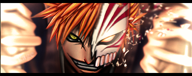
My first ever sig, let me know what you think of it and any improvements I can do to it:

Been watching/reading a lot of Bleach lately...
What do ya think?
and not bad for a first Munsu
Last edited by Kagemane_no_Jutsu; Tue, 03-13-2007 at 10:17 PM.


I like the background a lot, actually. I think it works well with the sig. Just soften up the render or at least some parts of it.
^yea I think the render is too sharp for the bg...but I didn't use any chrome or filter effect for the bg or any c4d.
and what are you so suprised about? It was my first sig in a while using anime and I handmade everything on there except for the render.


I hear ya, well I think I might be getting back into it so expect to see some better stuff from me.
heres something I just finished....

Last edited by Kagemane_no_Jutsu; Fri, 03-16-2007 at 07:00 PM.
Damn Kage, havent lost your touch. Hopefully I'll find the time to do something again -_-
For all you awesome people, it's just Phoenix. The numbers are just the amount of times people misspell it.


http://www.deviantart.com/deviation/51030328/
Stupid little vector wallpaper. It goes well with my current skin on windows, though.
@kage i reallly like it, good to see you back
@master_me it looks like the orange and red and yellow circle thing should be behind the wing. other than that looks good
yes i know the Z looks like a L... :/
I'm official.
Holy hell Kage how do you do that? Teach me! T_TOriginally Posted by Kagemane_no_Jutsu
I like that sig, Z. But like somebody said at irc, get rid of the letter. Right now it's screaming: "I don't belong here!"
I'm not too sure of those vertical lines on the left, either, but it's not like they would really bother me, and I deem they are a part of the vision you had in mind while making the sig.
New sig, using the only render from DF's pack that I actually like.

Last edited by Board of Command; Sun, 03-18-2007 at 09:34 PM.
I really like that one as well, and your sig isn't half bad at allOriginally Posted by Board of Command
image fail!


New stuff. Nothing amazing.
http://www.deviantart.com/deviation/51140944/
Quick wallpaper. It's simplish.
http://www.deviantart.com/deviation/51141219/
Decent photo manip.
I think the text ruins the wallpaper, and the photomanip is just too small.
But its good that your starting to work with larger canvases. Keep at it.