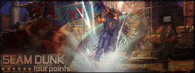
Looks alot better BoC.
Lucifus: Interesting style you got going there. I'm not feeling the Garra one but the other two were pretty nice. You got one huge problem with the text though. It doesn't fit at all in any of them. You have to blend the text together with the rest of the style otherwise it becomes the main point of focus and you don't want the text to be that.
I'm of the school that text should be simple and blended instead of extravagant. The sig should be able to go without the text. You can use an extravagant text if you don't use a render and only text. The main extravagant one is the Sasuke one, but the text is somewhat the same in the other two. The Itachi one would be great with lesser text.


 Reply With Quote


