You couldn't see his face the entire ep.?


You couldn't see his face the entire ep.?
R.I.P Captain America.


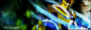
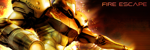
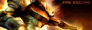
I'm gonna keep it on the face. I tried both the shoulder and the gun before I even thought of putting it on the face and neither were any better.Originally Posted by Fox Fire
Don't know about others, but I don't like the brown stuff on the right side.

Knives: It's just a scene in the ep, where everyone scrolls past Luffy, and Usopp just happened to be backwards. Watch the episode! -_-
Last edited by xDarkMaster; Sat, 08-05-2006 at 07:28 PM.
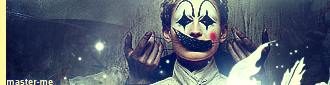
I made this about a week and a half ago before going on vacation, sort of forgot about it though. I kind of like it, I just wish I blended the render a bit better.
master_me + dA = <3

i think you did great blending it ^^
new one
^.^
edit: re did the white area

Last edited by Zinobi; Mon, 08-07-2006 at 02:36 PM.
I'm official.


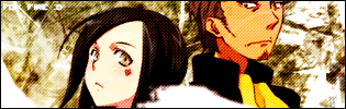
That's actually quite interesting. The render almost melts into the background. Very heavy blending, yet it doesn't look bad but somehow fitting. The difference in the blue hue between the background and the render does the trick of saving the image from being vague. The text portion goes nicely together with the render. Not bad work at all in my opinion.
I don't like the background because it doesn't seem to fit...
which one
v1
v2

I'm official.


#2 looks realy nice, keep it
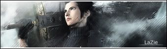
I was tired of my old sig so made a new one with talho and holland.
Hmm... I'm not sure how the background really supports the renders in that one. The colour scheme isn't actually unbalanced, probably because the background has so washed out colours it's almost white for pratical purposes, and thus supports any kind of render colouring. But that also means it doesn't have a very strong impact on anything, the theme and mood of the picture included.
And what is the white splotch between Talho and Holland? Also in a lesser degree I think Holland has been clipped somewhat crudely, barely above the eyes. It's as if the purpose is to emphasize the difference of height between those characters.
Well, despite all that it's a strangely calm picture. So, I'm not saying it's bad.
He can physically move Holland down a little bit so the cropping isn't so drastic.
well I wasn't even gonna put him in their but it looked stange so I did, meh who needs foreheads anymore i'm just gonna keep it as is because I didnt save the psd and i'm too lazy to do it the hard way.

Im not trying to make something as good as xDM or Kage here, but I just want to know if my skills have improved at all:


Well for one thing, that text is horrendous otherwise its not too bad...
its flat and the text is no good. try to play around with blending options and the render. the text no good at all look at some text tuts.
I'm official.
Something about the render bothers me. It seems to be slightly pixelated, perhaps, for example the cheek facing left. But moreover the render looks like it used to have lots of colours, but later was reduced to 16 colours, or so. It looks sickly. The background could support a smoother render and definitely smoother text like has been said.
Personally, I'm not a fan of "stick a face on a background" type sigs. There should be some kind of action involved. If you must make a "stick a face on a background" sig, at least make it a bit more narrow, ike 300x100 so it's not so empty where there is no face.
And also if you must make a "stick a face on a background" sig, your focus should be on the background and not the face itself. Since the sig is lifeless to start with, you should try to create some action by manipulating the background, like an explosion or something of that sort.
Here's my closest to "stick a face on a background" sig. It's not that good but it shows what I'm trying to say. Originally only the head fit in, but I added a hand and some lightning. The background also has some "direction" to it.

Last edited by Board of Command; Tue, 08-08-2006 at 09:18 PM.

That's a pretty cool sig Fox Fire I like it. I especially like the rough, brushy look. That was a nice touch.
Last edited by samsonlonghair; Wed, 08-09-2006 at 02:17 AM.
"Samsonlonghair - The Defender of the Oppressed And Shunned!" -Kraco
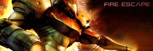
v1, I recolored Samus, and I lightened the effect a bit in v2. The green just seems kind of weird to me.
...I actually kind of like this one
Of course, I forgot a border --;;
EDIT:
A bit edited and I added a border.
Last edited by master_me; Wed, 08-09-2006 at 05:12 PM.
master_me + dA = <3
Nice and youre right the greed is bothering me
I'm official.
 Posting Permissions


 Reply With Quote