A new one I just made for another forum. That one was slightly bigger so I did a quick resizing. It turned out a little blurry but it isn't that bad. The eyes took a little more work than I expected to get this glowing effect.


A new one I just made for another forum. That one was slightly bigger so I did a quick resizing. It turned out a little blurry but it isn't that bad. The eyes took a little more work than I expected to get this glowing effect.


Why don't you post the bigger version to? just for show.
The scanlines are much clearer in the big version because I was too lazy to redo them when I resized it for Gotwoot.
Ooh, the glowing looks nice. It sort of stands out, though, amongst everything else, being green and all.
I have a few new things:
I like this one, even if it only was five or so layers. It's simple, it's clean.
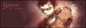
I touched up the Gaara one a bit, so the gourd doesn't draw as much attention.
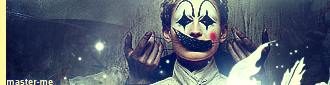
This was not only a bad Click Five joke, but a bad signature.
*Not worksafe, possibly*
http://i78.photobucket.com/albums/j1.../pedoalert.png
This was another joke, not really a sig though
master_me + dA = <3

wow it seems like ages since i visited this thread.
Master_me: The Gara sig is amazing. Really nice.
___---------------------------- "THE DROPOUT CREW"--------------------------------________Deblas, IfingHateTonTon, RyougaZell, dragonrage.________
________ we may fuck up alot but we always pull thru.

I haven't made a sig in months, but heres my comebackIt's just the tip of the iceberg.
Comments?
Last edited by LaZie; Wed, 06-28-2006 at 07:23 PM.

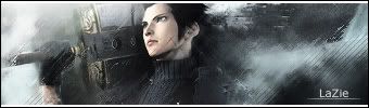
@ Lazie Kool, I like it. Its a bit dull but I like the style. Nicely done LaZie, you were overdue for a new sig. =P")
@ BoC Apart from the text, Its really kool. I should try doing a sig like that sometime....
@ Master To me, the Gaara sig looks too distorted. I can see what you were tring to get at, but it just isn't there yet. =P I like the Megaman one though, Really simple and smooth.
Last edited by Lucifus; Wed, 06-28-2006 at 09:14 PM.
Yeah Lucifus, i'm still working on the technique. This is my first try with it so it's not perfect
Good choice of render Lazy and very nice work on the text. The colors look a bit dull though, so does the bg. The lighting needs fixing to. If you can fix those things up you will have one kickass signature.

....................
Last edited by Thi3f; Wed, 01-09-2019 at 05:07 PM.

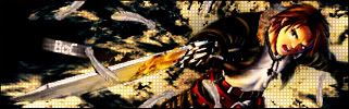
Yet another Saber sig...
Multiple variations. Please tell me which you think best and what it needs done. I am going insane trying to decide what do to use/do with them.
1
2
3
4
Help is of course most appreciated.
....................
Last edited by Thi3f; Wed, 01-09-2019 at 05:07 PM.
My suggestion: switch the positions of the two renders. Have the big Saber on the left and the hugging behind her on the right.

@IFHTT: I like #4 the best.
I got 2 new sigs and one editied sig.
And then the Revy sig below.
I like 4 the best too. Very nice sig IFHTT. I miss Saber......
Edit: lol, we have the same post count.

Not my best works but I'm currently working on them, so as with not final works I need some suggestions of course

image fail!
This one is actually older than my current sig. Again, it's a cropped and resized version of the original, to fit Gotwoot's sig limit. This time I actually remade the grid lines so they're visible compared to my current one.

Been awhile since I posted here, seems everyone is still making great sigs.
I have made two new sigs recently. Here's the first one:
Second one:
WARNING: Naruto Manga Spoilers
I really need to stop making sigs that I can't use until forever. >_>
Sorry, clicked post twice accidentally.
As I said yesterday, that Naruto sig looks f'ing awesome!
Thanks for all the feedback guys I went with Thi3f's advice, and here is the result... I am definitely a lot happier with it now.
Once again thanks, for the good comments, glad you guys thought so highly of it, I was seriously about to just give up on it. XD
 Posting Permissions


 Reply With Quote