Lucifus blushs.......Sharingan...But what the hay, it fooled Deadfire.

I'll go change that...........


Lucifus blushs.......
I'll go change that...........


It wasn't that you fooled me I was just overtaken by it's Purple-ness. Masa is right however that the colors are well balanced. Good work, and correct that spellingOriginally Posted by Lucifus
image fail!
I changed it up a bit, which versions better?


Definetly the second, I love the sharingan you added in and there's also no typo
I made this to go with my current, and also because it's been ages since I made an avatar. I've also got this animated version, but of course those aren't allowed.

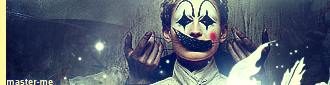
master_me + dA = <3
Cursed Seal =P.
Both those sigs look really kool, except for the guy who reminds me of the Burger King Mascot..........
Seriously nice job on the sig and ava.
Argh, I knew that as I wrote it. Thanks for the comments
master_me + dA = <3
I switch my sigs too often, so I decided to make someone else a sig. Made this one with the same technique I made my current sig.
If the comments are positive, I'll pm it to her.
Anyways, what do you guys think of this one?


I like it quite a lot. There isn't wasted, empty looking space at all, the render has nice cropping and positioning. You seem to be a fan of symbols placed into the background, like the wind wheel in this one, so I won't comment that.
The colour balance is quite interesting. The red, orange and yellow hues fit perfectly, and strangely enough the almost violet shade in her hair doesn't clash either, badly. However, I don't see the point of the mostly empty headers you have been adding to the left of the images. But I guess that's some personal trick of yours.

Lucifus on both of your new sigs do me a huge favor...
Take out any little extra things you threw into the background. Everything except for the curse seal :P
On the sasuke sig take out the little techy things and get rid of that god awful border. Throw in a nice 1px black border and you'll have a beautiful sig.
On the gift for kit kat take out the little sun thing on the right and that nasty outer glow border and just leave it again with a 1px black border.
Task completed o great and wise one.
I guess the KitKat one looks better =P.
I knew the techy stuff on my sig was really out of place, but when I finished the sig and was about to remove em I already merged the layers and it was already out of the history.")
So I just fixed it pixel by pixel.
On the border of my sig..........well....I've got nothing to say for myself. T-T
Edit: O, and at Kraco, I like it =P lol
Last edited by Lucifus; Fri, 06-02-2006 at 07:39 PM.
Ho... Are you telling you don't save your work at all before the end, when you apparently merge and save in jpg? That's peculiar, and surely shows a lot more trust in PS than I have ever had (for a reason, since the program has crashed sometimes).
Much better! I love em haha
Err, I suppose it's too late to mention the ear's a bit off, but it's not a huge deal. I love it anyhow. Oh, and I might add GIFs (though only 256 colors) are fully transparent. .pngs are too, but not everyone uses Firefox and IE can't correctly view transparencies in .pngs.
master_me + dA = <3

....................
Last edited by Thi3f; Wed, 01-09-2019 at 05:08 PM.
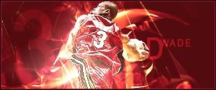
EASTERN CONFERENCE CHAMPS! TAKING THE FINALS BABY!

First Gilgamesh sig, I believe.

Last edited by Board of Command; Sat, 06-03-2006 at 10:26 AM.
Nicely done, I like it, I also think its the first sig I've seen you done without a gun or a sword.
Just did this.
Anyone like it? Something about it doesn't spark to me.
Edit: Also did this at the request of Kooshi. Whad'ya guys think of it? =S

Last edited by Lucifus; Sat, 06-03-2006 at 08:26 AM.
I don't like how the renders are colored in along with the background. Make then a different tone so they stand out. And the backgrounds are very bland.

My latest work, another Gaara sig! It's a photomanip with a bit of brushing thrown in. As always, any thoughts are appreciated.

Blur the background. Gaussian blur 1.5 px.
 Posting Permissions

 Reply With Quote