Page 208 of 337 FirstFirst ... 108158198204205206207208209210211212218258308 ... LastLast
Results 4,141 to 4,160 of 6729

Thread: New sig or wallpaper? show it off here!

  1. #4141
    Well theres a couple things I think you could fix to make the sig better.

    Focal point (the render) needs to stand out more so theres something for the eye to focus on. Do this by sharpening the render, and making more contrast between the bg and the render (not to be confused with the contrast adjustment).

    Change the text as well.

  2. #4142
    Junior Sexfiend PSJ's Avatar
    Join Date
    Jul 2003
    Location
    At a bar
    Age
    36
    Posts
    5,104
    Yea, i see what you mean. I'll try to fix that.

    EDIT:

    Alright fixed the abstract, i think it looks much better so what do you guys think?


    EDIT2:

    Here's the old version just so you can see the changes.

    Last edited by PSJ; Sat, 05-13-2006 at 11:23 AM.

  3. #4143
    Remnant of Woot Lucifus's Avatar
    Join Date
    Sep 2005
    Location
    Photoshop, Eclipse, Notepad
    Age
    34
    Posts
    1,949
    I have never done a abstract, so I don't know how hard it is to do one, but it looks likes really complicated. Looks uh..very unique and kool, but needless to say, very pixelated.

    But, I'll assume that this is infact a pretty kool abstract NIcely done man.
    Don't believe in yourself, believe in me, who believes in you.


  4. #4144
    Junior Sexfiend PSJ's Avatar
    Join Date
    Jul 2003
    Location
    At a bar
    Age
    36
    Posts
    5,104
    Hmm doesn't look to pixelated on my screen... It's basicly mostly brushing and an abstract render, some lighting and stuff, basicly the same process as a normal sig, but i am in no way very good at this, i've seen guys do loads better than this. But yea you need to try diffrent things to improve.

  5. #4145
    Remnant of Woot Lucifus's Avatar
    Join Date
    Sep 2005
    Location
    Photoshop, Eclipse, Notepad
    Age
    34
    Posts
    1,949
    Really? Then its prolly just the monitor I'm using, at a library. Now then I look at it, all the sigs look pixelated. I'll take another look at her when I get home.
    Don't believe in yourself, believe in me, who believes in you.


  6. #4146
    Doesnt look pixelated but it does look weird, like its blurry and messy kinda looking. Lighting needs direction and it needs to compliment the focal point.

    heres an old abstract of mine


  7. #4147
    Junior Sexfiend PSJ's Avatar
    Join Date
    Jul 2003
    Location
    At a bar
    Age
    36
    Posts
    5,104
    Yea there's something about it that i really can't put my finger on but it does look a bit blurry and messy. About the lighting well that has never been my strong point, i'll try to work that out.

  8. #4148
    Drifter dragonrage's Avatar
    Join Date
    Jan 2006
    Location
    if you find out tell me.....
    Posts
    1,229
    @ PSJ.... The abstract sig looks alright, i think that the face that there are random spot of color in the sigs makes it strange. With there being a darkish gray backround and color spots all over the sig makes it look kinda messy.

    @ Kage.... Nice new Halo sig, its blended quite nice. These intermediate tut you talked about , where can i find them?
    ___
    ---------------------------- "THE DROPOUT CREW"--------------------------------
    ________Deblas, IfingHateTonTon, RyougaZell, dragonrage.________

    ________ we may fuck up alot but we always pull thru.


  9. #4149
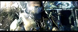
    As some of you might have been able to judge based on my title and sig, I'm psyched for Halo 3. That being said, this is my first sig in awhile. At this point I'm unsure whether or not I should add some text. As always, any help is appreciated.


  10. #4150
    I just stumbled across this render and couldn't resist making a sig out of it. I can't think of anywhere else to put the text (blending, etc) so I just stuck it in the corner. Although I think it looks fine, some of you would probably disagree.


    Screw it, here's version 2:


    Sigh...version 3. Hair is more transparent like my other Emeralda sig, and font is changed. Man, this thing is hard to get right.
    Last edited by Board of Command; Sat, 05-13-2006 at 08:02 PM.

  11. #4151
    Drifter dragonrage's Avatar
    Join Date
    Jan 2006
    Location
    if you find out tell me.....
    Posts
    1,229
    Nice BoC, very nice. I like version 2 more, the BoC on the collar was a nice touch. The only thing i can see that can be improve is the font but that is not necessary, its awsome as is.
    ___
    ---------------------------- "THE DROPOUT CREW"--------------------------------
    ________Deblas, IfingHateTonTon, RyougaZell, dragonrage.________

    ________ we may fuck up alot but we always pull thru.


  12. #4152
    Junior Sexfiend PSJ's Avatar
    Join Date
    Jul 2003
    Location
    At a bar
    Age
    36
    Posts
    5,104
    Whipped something together for another forum.


  13. #4153
    Remnant of Woot Lucifus's Avatar
    Join Date
    Sep 2005
    Location
    Photoshop, Eclipse, Notepad
    Age
    34
    Posts
    1,949
    Now thats f*cking sweet. Nice job.

    @ BoC, that sig also pawns, and yea, I think version 3 owns man. Same to PSJ's sig.

    I can't really find anything wrong with either sig, Nicely done to both of ya.
    Last edited by Lucifus; Sat, 05-13-2006 at 10:11 PM.
    Don't believe in yourself, believe in me, who believes in you.


  14. #4154
    I changed the BG on my Halo 3 sig abit, I like it more this way.


    Here's a version without the white brushing.


    Seeing as how nobody had anything to say about it, I take it it's perfect?

  15. #4155
    Remnant of Woot Lucifus's Avatar
    Join Date
    Sep 2005
    Location
    Photoshop, Eclipse, Notepad
    Age
    34
    Posts
    1,949
    Like the second version xDm, but, I think ya should add some text, like in the top left corner. I myself can't wait for Halo 3. Halo 2 for that matter, Only played Combat Evolved, don't have an Xbox
    Don't believe in yourself, believe in me, who believes in you.


  16. #4156
    Photoshop Hero Alhuin's Avatar
    Join Date
    Jun 2004
    Location
    Planeptune
    Age
    35
    Posts
    997
    Haven't really made a new sig recently... but I have done a couple photo-manips. They're too big to post here, but you can look at them on my deviantART site (link below). I'd appreciate some comments, as photo-manipping isn't something I regularly do... and therefore know that they can be done better. Of course... I still do have some sigs in the making... they're just on hold right now.

    It's dangerous to go alone. Take Nep.

  17. #4157
    Remnant of Woot Lucifus's Avatar
    Join Date
    Sep 2005
    Location
    Photoshop, Eclipse, Notepad
    Age
    34
    Posts
    1,949
    Theres a ton of stuff there, I don't knwo what a photomanip is so I can't comment..=S

    But all the stuff their, have all been excellently done. Don't know you, but you've gotta be good with Photoshop. And that Tsubasa Chronicle sig is f*ckign sweet man.
    Don't believe in yourself, believe in me, who believes in you.


  18. #4158
    I agree 100% with Lucifus on the TC one. By the way, Lucifus, photo manip is in short manipulating a photo. For a really awesome example, see KaGe's photo manip sig tut(s).


    I've finally come close to mastering not using brushes, and I feel good about it too

    master_me + dA = <3

  19. #4159
    master_me, I think you should work on the blending between background and the guy's shoulder. The transition is very abrupt. I can see that his arm is down there so you have to keep that, but maybe you can blend in the upper part a bit.

  20. #4160
    Quote Originally Posted by dragonrage
    @ Kage.... Nice new Halo sig, its blended quite nice. These intermediate tut you talked about , where can i find them?
    Well I think one or two of the ones I posted in the Tutorial section here could be considered intermediate. Also try looking through the tutorial sections on these sites:

    www.nsl.com
    www.GFXHaven.com = my home :P
    www.Climb-X.com
    www.NationalSigLeague.com

    Quote Originally Posted by BOARD_of_command
    I don't think those kind of brushes look right with a soft anime render. Not feeling the BOC text either. Also try using color balance and more adjustments then just hue/saturation. Not a bad sig at all though.

    Quote Originally Posted by PSJ
    Whipped something together for another forum.

    Well the first thing I notice is the highly contrasted areas where theres no color left and its just intense red and bright yellow then turns to white. Those are nasty try to stay away from em. Sharpen up the render a bit too. And why haven't you posted this on GFXHaven :P? Theres tons of people ready to help

    Also don't like big giant red hue'd c4d render. Takes up too much space as is just graphically ugly. Try using c4d on colordodge and make them less a part of your sig.

    Quote Originally Posted by xDarkMaster
    Right now Master Chief isn't the main focus point of the sig for three reasons; he is too small, he's too blurry, and he's all the way in the corner. Try keeping your main renders towards the center of the sig to draw attention. Sharpen it up a bit too. Another problem I see with it is the flow of color, or lack there of. Take a very big colorful picture you like, put it over all the layers, and set it to overlay (might have to blur it so its not recognizable) then mess around with the opacity. Also use color balance layers and photo filters. It's all about the adjustments people.

    Looking at this sig again I see the main purpose was just to show off the trailer pretty much. But yea that was still some good advice :P

    Quote Originally Posted by master_me
    I agree 100% with Lucifus on the TC one. By the way, Lucifus, photo manip is in short manipulating a photo. For a really awesome example, see KaGe's photo manip sig tut(s).


    I've finally come close to mastering not using brushes, and I feel good about it too
    Well this sig is having contrast problems also, you boosted it up way too much. Text is nasty, try just setting a nice small text into the corner without a stroke or any crazy designs. Just use arial font. Render was blended nicely. Not liking those lines crossing through the sig though. Keep reading tutorials, and incorperate brushing and other skills together for better outcomes, it doesn't matter if you didn't brush or not if the sig looks pretty bad =/ so yea keep working.

    YOU SHOULD DEFF TAKE THE TIME TO READ ALL OF THOSE IF YOU WANT TO GET BETTER!

    and heres my new sig, probly my favorite everrrrrr


    DISCUSS XD
    Last edited by Kagemane_no_Jutsu; Sun, 05-14-2006 at 11:40 AM.

Posting Permissions

  • You may not post new threads
  • You may not post replies
  • You may not post attachments
  • You may not edit your posts
  •