well a friend of mine asked me to make a sig for her and and this was the outcome
C&C
i really like that GTA one by master_me
the samus and predator sigs are both well done but i like the predator one more
GJ everyone


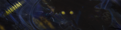
Major testing again, lol
Being my current age and attempting to utilize the powers of Imageready alone, I think the outcome is sort of nice. The darkness couldn't have been helped because of the render, but I'm not real please with it anyway.
master_me + dA = <3


My latest work. Feed back appreciated.
Edit: with or without borders?
Last edited by heero; Wed, 04-26-2006 at 02:24 AM.

@djblingsingh : I really like your sig but i don't like the dark area in the center
@heero: Like the sig; would be nice if you play around with the text
I need to do ps again, see some great sigs


@Heero: Aye, I have to say the text doesn't fit currently the impressive graphics. Right now it looks like the name is added there as a signature indicating you made the image, as in a painting. However, I don't think that's really an issue with a sig. Maybe it's just my personal view, but I think if there's your name there, it should rather be there to help people recognize you, and be an integral part of the image. But like I said, maybe that's just me. Very good work, though.
thx for the feedback guys. Ill try to fix the font.


Maybe play around with levels and curves a bit, because I cannot see a thing.Originally Posted by master_me
I'm actually ditching that one. I was testing a new style and apparently it doesn't work with dark renders. I might make another sig using that render later, though.
I made that with a combination of GIMP and Imageready, Imageready was just for the text though~ I honestly love the outcome of this one.
master_me + dA = <3


Yeah, master_me that one looks sweet. Nice work dude!

nice sig. dude. good job, keep it up.
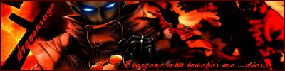
___---------------------------- "THE DROPOUT CREW"--------------------------------________Deblas, IfingHateTonTon, RyougaZell, dragonrage.________
________ we may fuck up alot but we always pull thru.

GIMP? what is GIMP?
I'm official.
Gimp is a freeware editing/drawing program. Offers a wide variety of functions. Maybe even close to the level of PS. I haven't personally used it, but many do and are happy. From what I hear it's somewhat different compared to PS, so it might not be easy to get used to it if you have been using PS (or of course vice versa from Gimp to PS).
@master_me: That's indeed a sweet sig. Impressive work. The colours especially are very well balanced.
I much prefer Photoshop, but sadly, my copy is broken. GIMP isn't great for image manip unless you're talented and have a lot of experience in the field, which of course I don't. If you want to make some nice graphics though, GIMP is nice.
master_me + dA = <3

That's a nice sig master_me. I really like that render, and the graphics look great. I love the effect over Sora as well. The text is a little hard on my eyes, with the diagonal pattern. But it still looks great. Might I ask where you got that (and maybe other KH renders)?
Here's an update of an older sig I did. I didn't mess much with the render itself, just messed around with everything else. Hope it looks decent... I personally like the render and would love for the sig to be awesome...
The text may be off... but I'm not in a creative mind-state at the moment, so that's all I could think of to do.

Ok, Ok, what do you guys think of this? Do you think its a small improvement?


Not really, this one is more of a step down. BG is dull. Text doesn't fit. Right render, what is the right render of? I see the hat... I like the left render though.
Thx. i got the right render from the 4th movie where Luffy is about to use Gomu Gomu Rocket. And what is BG? (Im a noob at this)
BG = BackGround.... and yeah i agree with xDM that your previous work was better than this. the render on the right is horrible, and the background is way to simple, and it doesn't fit at all. I think the background is your main problem, and i suggest that you look at some of the tutorials on image enhancing, that will bring more life to your render.
___---------------------------- "THE DROPOUT CREW"--------------------------------________Deblas, IfingHateTonTon, RyougaZell, dragonrage.________
________ we may fuck up alot but we always pull thru.

Had some free time on my hands so I thought I'd hit up the Photoshop again. I haven't updated my brushes and such and I think I'm still kinda rusty. The text could probably be better to (especially the placing of my name). I thought I'd do a Wisdom Sora sig since I haven't seen that render used that much around here. Much thanks to whoever rendered it in the Render thread (I think it was Phoenix, right?). And if your wondering why I wrote Sanctuary for the text, I was listening to the song while making this.

This fantastic Sousuke sig was made by the one and only Lucifus! Thanks man!
I like it, the BG looks good and also fits with the render. The problem, as you said, is the text. Is it just me or does the render look stretched horizontally?
 Posting Permissions


 Reply With Quote