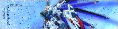
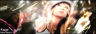
Nice. Very clean render, and dreamy background. Text is kinda small, but I can read it. Like your new avatar too [img]i/expressions/face-icon-small-smile.gif[/img]
btw, more then 20 pixels extra ^_^


Nice. Very clean render, and dreamy background. Text is kinda small, but I can read it. Like your new avatar too [img]i/expressions/face-icon-small-smile.gif[/img]
btw, more then 20 pixels extra ^_^

Nice GLS.
New current:
EDIT:
Forgot I did this one till I got bored [img]i/expressions/face-icon-small-tongue.gif[/img]

For all you awesome people, it's just Phoenix. The numbers are just the amount of times people misspell it.


AnimePunk: Yeah, you should try to work on your blending a little bit more. Also, the left side seems a little flat and blank. Try giving it some more depth and contrast to make it a little more visually interesting.
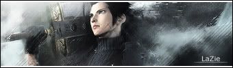
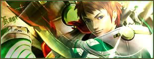
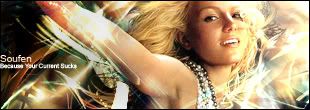
GLS: I love the simplicity of your sigs. Personally, I much prefer clean simple sigs to really cluttered ones. I'd say it's not your best work, but a nice sig nonetheless. The avatar however is awesome. I like it a lot.
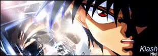
Phoenix: I LOVE THAT ROCK LEE SIG!!!! Wow, it really looks great. Very nicely done!! The only thing I don't really like about it is the lens flare on the left. It looks kinda out of place and detracts from the overall effect. Everything else though....the blending is great, the flow is beautiful, and it all just fits. This is my favourite from you so far.
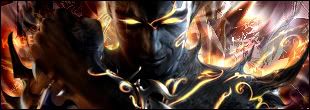
The other one I feel kinda meh about. It feels kinda disjointed and spliced oddly.
I see what you mean with the Train sig. It was bothering me for a while, but I relized what it was when you
said something. Here it is updated.
Thanks for the Rock Lee sig. As for the lens flare, I like that part because it draws your attention toword Lee,
but I see what you mean.
For all you awesome people, it's just Phoenix. The numbers are just the amount of times people misspell it.
Ah, MUCH better. So much easier to look at.
As for the Lee sig, I think you do need something there to draw attention to Lee since the other side of your sig is so bright, but a lens flare just seems really out of place. Maybe play around with it and find some other way of drawing attention over there. Or even use some effects on your flare to make it less orderly and spherical, y'know?

ha...well i pointed it out because alot of people get dependant on the lens flare.Originally posted by: PSJ
That's exactly what i did.... There was no sun in the original picture and with my limited knowledge that's all i could do.
In this case, it stands out because you have some artistic brush rendering on the background to give it a slightly rippled-stroke effect, but the sun has no such texture on it.
10/4/04 - 8/20/07
It almost looks like Rock Lee is going to do a rasengan. You just need his hand behind the lens flare [img]i/expressions/face-icon-small-tongue.gif[/img]
But I like your new sigs.

new sig


Just made it, id say it needs better font and some more bg brushing. Just have to wait till I can find some better ones.

The font isn't really an issue right now, first of all is the bg next is the render, that actually doesn't look all that good, maybe make it a bit bigger. But you got a good start there, just work with it a bit more.

a redo
made another for the same person
comments
There is a bit to much black in the first one and a bit to much white in the second one. In the first one the render looks over contrasted and in the second one the render is badly cut and doesn't look too good overall. There is room for improvement but given the time you have been doing sigs it looks good. Just keep working and you will improve. That's one of the hardest things to do, keep the interest up even when the sigs doesn't turn out the way you wanted them to.
I need a font for this. Would be helpful if you could inform me of a fitting one for this sig. I'm not too good with fonts. [img]i/expressions/face-icon-small-happy.gif[/img]

Just get one of the fonts you have and try out some stuff. What layer do you have on top of the render? Try having the render on top, it looks alot cleaner.

sig nr. 3 i've tryed something out.. comments plz.

The idea is nice but the background lacks depth which makes the middle very empty. Keep brushing the background and then maybe stick some text in the middle. You could also try having the renders bigger, also if you haven't noticed, the hair on the left Ichigo is cut off.

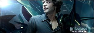
Don't rely on brushing + color balance so much. Try new things. A lot of you have improved a lot, especially phoenix. Great job guys, glad to see the GW art section is still going strong.
Here's some of my recent work:
two requests
gift
I like your third one the best, kage. It's a really interesting blending between the character and the background
10/4/04 - 8/20/07
Nice Kage. I really like #'s 1, 2, 5 and 6. #4 is a little confusing though. Can't figure out what it is [img]i/expressions/face-icon-small-tongue.gif[/img]
For all you awesome people, it's just Phoenix. The numbers are just the amount of times people misspell it.
@Noid: Your sig is really overcontrasted. Try to make your render a little more natural looking. If you do colour adjustment, do it to match the colours of your render and background to each other. Also, since there is so much empty space featured in your sig, mix up your brushing a bit and make that empty space a bit more visually interesting. Plus, a border is always nice.
@Lazykid: The way that I do font is just trial and error. I download a whole bunch of fonts at once, then type my text on my sig, and try out different ones that I think would work. Granted, I still suck at text, but the only way to learn is by just trying and doing.
Oh, and I like your current sig.
@AnimePunk: You want to be really careful when you're cutting renders. Even a little extra time spent being more precise will make your sig look heaps better.
@T-S: Keep working at it. That sig has a lot of potential, but you need to put some more work into the bg, and add some text to it as well.
@Kage: I like how you keep picking up new styles. Everything is looking very nice. The only one I don't care too much for is the 4th. It just seems kindof bland.
Alright, and now for me, I made this one over the weekend. I feel a bit meh about it, but it's my first time making a sig with no render. The text is still bothering me. I've tried a lot of different things, but I still can't make it look like it really fits.

 Posting Permissions

 Reply With Quote