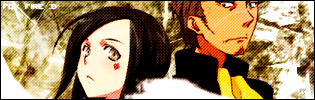
ahhh a sasuke banner i made, somthing doesnt really look right with the bakground, but this is wat i made


ahhh a sasuke banner i made, somthing doesnt really look right with the bakground, but this is wat i made
really cool
10/10
ur font gets better


there's something about that 2nd sasuke head that seems like it shouldnt be there, at least not so profound anyway. you should try using a layer effect that will blend it into the background, perhaps blue and more faded.
can't go wrong with that double-layer-blur effect you got goin, though
10/4/04 - 8/20/07

something is wrong with it, but I dont feel like going on bout it, but anyway, its good, 9/10.
[21:48] * DO furiously masturbates to #gotwoot
____________________________________________
It's the composition that's off. With the head that's in the right-middle, I'd fade it into the background, or perhaps vary the depth of field a bit. You have three facial closeups, all relatively the same size and framing, it'd be more visually interesting with perhaps one profile, or one extreme closeup of his eyes.

it looks a little bit crowded, I think with less pictures and following lasaire advise it should be a really good sig.


I think there's way too many heads in that picture. But it looks really cool.
</div><table border='0' align='center' width='95%' cellpadding='3' cellspacing='1'><tr><td>QUOTE (Power PMV @ Feb 23 2004, 01:46 AM)</td></tr><tr><td id='QUOTE'>
hey it was my advice first
10/4/04 - 8/20/07
heres another banner i made this time of hinata, with NO turtorials incase som 1 asks tht again(happened before) also im gonna post my banners in this section becuz i dont wanna take up space and bug more ppl

I like this one Nazim, though I still think you could use some variation in the views of Hinata..the center image and right hand imag are very similar, and all are relativetively the same level of closeupness (is that a word?) to her face, with the nice dynamic angle of the left image to break things up. I'd replace that center image with a more full-body shot to make the composition more interesting.
good point, ill do a different view in my next banner, and a diff number of ppl, ma be 2, possibly 1
is that the dream effeckt in ur sigS?
tell me how u did it
dream effect?

Nice 9/10
m key? is that like, implying that you are eating your house keys or something?
its shameful to spam, ya know
that is how you create a technique like the one used in those sigs. somebody requested, and i delivered
10/4/04 - 8/20/07
uhhh no its an expression m key like ok but used while talking, for instance
"sally is going to the store"
"m key" or "ok"
heheh
what he´s trying to say is "mkay" like that dude in south park...or atleast i think thats what he´s trying to say...
ya like tht one teacher in south park, with the huge head, and hes saying ok but he suks at pronouncing so hes all like mkay
</div><table border='0' align='center' width='95%' cellpadding='3' cellspacing='1'><tr><td>QUOTE (Naszim @ Feb 26 2004, 09:03 PM)</td></tr><tr><td id='QUOTE'> ya like tht one teacher in south park, with the huge head, and hes saying ok but he suks at pronouncing so hes all like mkay </td></tr></table><div class='postcolor'>
M KAY
TIMMMMMMMMMMMMMMMMEEEEEEEEEEEEEEE ^^
i love that
</div><table border='0' align='center' width='95%' cellpadding='3' cellspacing='1'><tr><td>QUOTE (AssertnFailure @ Feb 26 2004, 06:08 AM)</td></tr><tr><td id='QUOTE'> you duplicate a layer, add some guassian blur to the upper one, then apply a layer blend (i forget which blend works best, i usually just scroll through em) </td></tr></table><div class='postcolor'>
m key
 Posting Permissions

 Reply With Quote