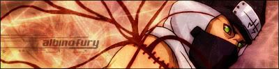
another banner from me, this time full metal alchemist


another banner from me, this time full metal alchemist

me like it, nice.
i just think u could have made the fonts more creative.
u mean shadowing, diff colour, and stuff like that?
Perhaps, but i've seen some pretty neat things done with fonts before, like making it glow, ray of light. etc
www.good-tutorials.com
they got tons of font tutorials. i think i'd be worth while to check it out.
i did somthing with the font, and here it is

Good picture of the character (can't remember his name yet), but yeah, somethings not right about that text.

I personally think its cause they stand out too much, what i mean is when you look at the sig its almost as if the fonts are the focal point, as i said just what i think.
[21:48] * DO furiously masturbates to #gotwoot
____________________________________________
its nice, a little work on the font and it be better 8/10
lol thanks, im gonna leave the font on this 1, for 1 it took a hell long of a time, a 2 i dont have time and 3 i can just improve the font in my next banner, thanks guys, next banenr i make ill work a lil harder on the font
</div><table border='0' align='center' width='95%' cellpadding='3' cellspacing='1'><tr><td>QUOTE (jing @ Feb 4 2004, 01:18 AM)</td></tr><tr><td id='QUOTE'> me like it, nice.
i just think u could have made the fonts more creative. </td></tr></table><div class='postcolor'>
same here

i totally agree with joker(did i just say that?!?)
btw if u wanna post a version without any text ill add some lettering for ya, i got so many fonts its not even funny.
</div><table border='0' align='center' width='95%' cellpadding='3' cellspacing='1'><tr><td>QUOTE (AlbinoFury @ Feb 4 2004, 12:02 AM)</td></tr><tr><td id='QUOTE'> i totally agree with joker(did i just say that?!?)
btw if u wanna post a version without any text ill add some lettering for ya, i got so many fonts its not even funny. </td></tr></table><div class='postcolor'>
lol, its surprising eh.
yes this would be a good idea, albino doesnt have the title of sigmaster for nothing.
[21:48] * DO furiously masturbates to #gotwoot
____________________________________________
heres wat i got now, i kinda messed up and dug my self into a hole with the background, but heres wat i came out with


the full metal achemist looks nice with black font shouldnt make it to flashy.
uhh ya, well i got REALLY bord, so i made another banner, here it is

it is nice, her name is Tayuya
THANKS!!!!!!!!! ;!!!!!!!!!! ;!!!!!!!!!! ;!!!!!!!!!! ;!!!, ta dum, heres it with the name

I like the sasuke one, are these up for grabs?
i made it with black font too, any comments on my sasuke 1?
go ahead and use any of my banners if u want to
 Posting Permissions

 Reply With Quote