

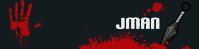
or


or
bottom one without the orange border
i think the orange border in the top one is a little too thick, but it looks a little too plain completely without it, too... maybe you could make the borders thinner, so it wouldn't eat the picture so much?


the bottom one w/o the border looks better.
Formerly known as 'Animemaster'
i agree, the bottom one does look best. or if the boarder was a bit thinner or something? can't quite put my finger on it. (= nice sig
Personally i think it's kinda fat... should be shorter, more like a web banner so it dosn't take up so much room if you do multiple posts in a forum like this one. Other than that, good job!
hmmm 2 votes for me to get castrated....................... i should get on that
thanks for input those who voted this will have to do till exams are over i guess and i got some time


the second one looks a lot better. less orange is always good.
the orange border is too bright...spoiled the sig. bottom one is better
definitely the bottom one
you should be castrated!!!!
just kidding,
</div><table border='0' align='center' width='95%' cellpadding='3' cellspacing='1'><tr><td>QUOTE </td></tr><tr><td id='QUOTE'>you should be castrated!!!!</td></tr></table><div class='postcolor'>
lol
 Posting Permissions


 Reply With Quote