Page 3 of 7 FirstFirst 1234567 LastLast
Results 41 to 60 of 132

Thread: Archangel's Stuff

  1. #41
    It wasn't much Archangel's Avatar
    Join Date
    Feb 2008
    Location
    Portugal
    Age
    34
    Posts
    10,833
    Blog Entries
    3
    Thx for the tip Shinta i may try that

    K till Kray's sigis done i think i'll post some more of my drawings

    http://i20.photobucket.com/albums/b2...rutoSasuke.jpg

    I know what you're thinking and yeah, i'm ashamed to say i used photoshop on this one. Let me explain, as you can see there's sort of a line between their eyes, i wanted to make this kind of electric beam between them ( u know like they did in the anime sometimes ) but it got incredibly screwed up so i shopped it so it just looked like a smooth line ( still looks like shit tough )

    Except for that i think i kind of made a good job, in fact, i may color it and make a sig out of it later

  2. #42
    It wasn't much Archangel's Avatar
    Join Date
    Feb 2008
    Location
    Portugal
    Age
    34
    Posts
    10,833
    Blog Entries
    3
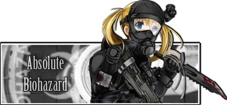
    Well i think this is it


    Honestly i just can't come up with any more ideas. I've downloaded a great amount of brushes and i think it turned out well lets just hope kray likes it too

  3. #43
    Awesome user with default custom title KrayZ33's Avatar
    Join Date
    Aug 2007
    Age
    36
    Posts
    4,377
    It's cool!

    I wish my name would be on it somewhere, for example on her helmet? (or knife?). that would be awesome!

    great job there, this is really better imho.

    a little more blood would be cool, but I don't know in which way it is possible... maybe it will destroy the picture, so its probably better to leave it that way, without the blood (I don't know)

    But if you are tired in doing anymore, I'd take it as it is, even though I would like you to think about the "name on helmet" idea (or somewhere else on the picture)

    edit: [/URL]

    what happened there btw :P? (I redrew that line with red)
    Last edited by KrayZ33; Tue, 07-08-2008 at 05:32 PM.

  4. #44
    Pit Lord shinta|hikari's Avatar
    Join Date
    Jan 2006
    Location
    The Pits
    Age
    38
    Posts
    10,653
    Blog Entries
    1
    Name should definitely be on the gun since there is a perfect space for it at the bottom (an engraved feel would look insane), and a bit more blood spatter can be placed on the gun, helmet, and clothing. The one on the clothes should be a darker shade though, to show cloth absorption.
    <img src=https://ibb.co/1dDDk6w border=0 alt= />
    Peace.

  5. #45
    It wasn't much Archangel's Avatar
    Join Date
    Feb 2008
    Location
    Portugal
    Age
    34
    Posts
    10,833
    Blog Entries
    3
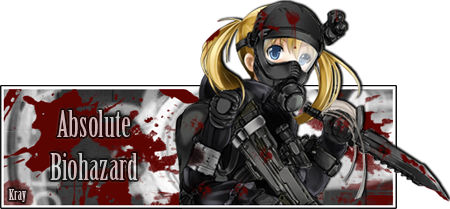
    Kray's sig 2.5


    Err i may have overdone it with the blood a lil bit hehehe...

  6. #46
    Pit Lord shinta|hikari's Avatar
    Join Date
    Jan 2006
    Location
    The Pits
    Age
    38
    Posts
    10,653
    Blog Entries
    1
    That's not a little... lol.

    EDIT: The blood on the girl looks great though. I think that should be more than enough.
    <img src=https://ibb.co/1dDDk6w border=0 alt= />
    Peace.

  7. #47
    Awesome user with default custom title KrayZ33's Avatar
    Join Date
    Aug 2007
    Age
    36
    Posts
    4,377
    Haha ya thats too much blood :P the blood on her armor und helmet ist very good though!

    but with all the blood behind her and especially on the left side of the picture, it looks too brutal ^^, you destroyed the nice biohazard-sign with it, hehe.

    btw, I guess the idea with the name on the weapon/knife/gun is a no go? I always feel bad when I'm complaining about others work, especially if its done for my sake, but I'm not satisfied with the name at the moment (sorry )


    the blood itself however looks very good, nice splatter-effect and somehow very realistic

  8. #48
    It wasn't much Archangel's Avatar
    Join Date
    Feb 2008
    Location
    Portugal
    Age
    34
    Posts
    10,833
    Blog Entries
    3
    Im sorry kray i messed up

    I saved over the bloody background over the normal one accidentally so i can't make any other modifications

    Can u use that one?

  9. #49
    Awesome user with default custom title KrayZ33's Avatar
    Join Date
    Aug 2007
    Age
    36
    Posts
    4,377
    hmm wheres the problem? the "bloodless" version is just ~3 posts above the bloddy version, can't you redo it it from there?

    or is there a problem, because the layers arn't saved correctly or something? (well since you only have to add a bit of blood and the name this shouldn't be much of a problem)

    however if your post actually means that you don't want to work on it anymore, than this is fine too, you just have to say so... its not like I'm getting angry ^^ lol

    maybe I can get Lucifius to work on it a bit more or so

    (btw sorry for the late answer, I was on a vacation)

  10. #50
    It wasn't much Archangel's Avatar
    Join Date
    Feb 2008
    Location
    Portugal
    Age
    34
    Posts
    10,833
    Blog Entries
    3
    Well i saved over the previous layers by accident and i've made the blood by using brushes which means it can't be undone.

    I won't lie to you i was a bit tired of working on the same sig but i really didn't do it on purpose, i don't like to leave my work unfinished but altering it now is just near impossible, sorry

  11. #51
    It wasn't much Archangel's Avatar
    Join Date
    Feb 2008
    Location
    Portugal
    Age
    34
    Posts
    10,833
    Blog Entries
    3
    Archangel's deviart

    i just got an account there, go check it out when u can, i've posted some work that isn't on the forum.

  12. #52
    It wasn't much Archangel's Avatar
    Join Date
    Feb 2008
    Location
    Portugal
    Age
    34
    Posts
    10,833
    Blog Entries
    3
    Since Soul Eater is quickly becoming one of my favorite animes i thought i would do a little work with episode 20, featuring my new fav character, insane maka

    Huge animation gif !


  13. #53
    It wasn't much Archangel's Avatar
    Join Date
    Feb 2008
    Location
    Portugal
    Age
    34
    Posts
    10,833
    Blog Entries
    3


    Something i did for Zell

    Well it wasn't my intention to make a sig for him, i just wanted to do something with Misaka and it just turned into a sig.

    Then i decided to be a nice guy and offered it to him since i completely ripped off the render and the text idea from the one he did O_o

    Seriously, i think he could sue my for copyright infringement if he wanted to

  14. #54
    Awesome user with default custom title KrayZ33's Avatar
    Join Date
    Aug 2007
    Age
    36
    Posts
    4,377
    Quote Originally Posted by Archangel

    Seriously, i think he could sue my for copyright infringement if he wanted to

    are we supossed to laugh?

    btw nice signature, even though I'd make the left text a *bit* more visible and leave out the name on the right side.

  15. #55
    It wasn't much Archangel's Avatar
    Join Date
    Feb 2008
    Location
    Portugal
    Age
    34
    Posts
    10,833
    Blog Entries
    3
    Quote Originally Posted by KrayZ33
    are we supossed to laugh?

    btw nice signature, even though I'd make the left text a *bit* more visible and leave out the name on the right side.
    Not really

    Good for you, but I wouldn't ...

  16. #56
    Awesome user with default custom title KrayZ33's Avatar
    Join Date
    Aug 2007
    Age
    36
    Posts
    4,377
    well sorry for trying to give an opinion Oo?
    I thought you did post them because you want sum feedback

    not that you have to do what I say, but why such an unkind answer :/

  17. #57
    It wasn't much Archangel's Avatar
    Join Date
    Feb 2008
    Location
    Portugal
    Age
    34
    Posts
    10,833
    Blog Entries
    3
    Nah i just did and posted it cause i was bored

    I don't want want to mess with it anymore even tough i know you're right about the text

    Want me to make you a sig? I'd love to make something with saber-chan

  18. #58
    Awesome user with default custom title KrayZ33's Avatar
    Join Date
    Aug 2007
    Age
    36
    Posts
    4,377
    why not, I like my current one from Lucifus but that doesn't mean I'm not ready for a CHAAANGE! (if it's a good one that is and dark-saber is fine too btw)

    However try not to make the name too big (that is if you are going to insert it somewhere).. that's why I like Lucifus sig(s) so much..

    the names are visible but do not stand out.
    it's the same with your current Archer signature at the moment ^^

  19. #59
    It wasn't much Archangel's Avatar
    Join Date
    Feb 2008
    Location
    Portugal
    Age
    34
    Posts
    10,833
    Blog Entries
    3
    New sig for Zell


    Thoughts?

  20. #60
    Family Friendly Mascot Buffalobiian's Avatar
    Join Date
    Sep 2006
    Location
    Amaburi
    Age
    34
    Posts
    18,806
    Pretty good I think. Perhaps use a different shade for outlining the words so they stand out a bit more?

    Actually, the more I look at it now, the more I like the subtly, and how you can't really see it when you look at the sig overall.

    If it's not Isuzu-chan Mii~

Posting Permissions

  • You may not post new threads
  • You may not post replies
  • You may not post attachments
  • You may not edit your posts
  •