Page 1 of 2 12 LastLast
Results 1 to 20 of 61

Thread: Zen's Art Stuff

Hybrid View

Previous Post Previous Post   Next Post Next Post
  1. #1

    Zen's Art Stuff

    As I stated in my intro post I do some Anime art, I figure I should actually make my post here in the Fanart thread.

    Mostly Anime, both original and fanart, plus non-Anime series but done in the Anime style.

    First off, as it is nearly close to summer time, here's a couple of beach drawings(note this is not an Anime series):

    http://img246.imageshack.us/img246/2...anova05gg4.jpg
    http://img228.imageshack.us/img228/9...anova07tp5.jpg

    More later

    Z

  2. #2
    Vampiric Minion Kraco's Avatar
    Join Date
    Oct 2005
    Location
    :noitacoL
    Age
    46
    Posts
    17,963
    Though I couldn't draw if my life depended on it, but from what I can see, you are pretty good at it. Nice and clean lines and designs. I hope you will post some more anime/manga inspired next time. And uhh... I'm no racist but the blue colour also kind of puts me off... The backgrounds look far more hurried and less impressive than the girl, though.

  3. #3
    Moderator Emeritus masamuneehs's Avatar
    Join Date
    May 2005
    Location
    a fountain pourin' like an avalanche, comin' down the mountain
    Age
    39
    Posts
    3,874
    good job with the contours of the human body. The face looks a little scrambled in the second one, but that's fine. As you try different characters with different noses, lips, facial structures etc., you'll be able to do a standard face like hers in no time.

    The texture of the sand and sky is good enough, though the water in the second one is way too choppy. Not much to say on backgrounds. Be good to see other stuff, sketches, whatever. Also, Deadfire started a new site revolving around art, photoshop (making untalented fools like me look semi-decent) or hand-drawn or whatever. www.AshiftingPerspective.com I encourage you to join.

    Keep it up; like Kraco said, you've got talent and the only way to develop is practice, practice, practice

    Humans are different from animals. We must die for a reason. Now is the time for us to regulate ourselves and reclaim our dignity. The one who holds endless potential and displays his strength and kindness to the world. Only mankind has God, a power that allows us to go above and beyond what we are now, a God that we call "possibility".

  4. #4
    Quote Originally Posted by Kraco
    Though I couldn't draw if my life depended on it, but from what I can see, you are pretty good at it. Nice and clean lines and designs. I hope you will post some more anime/manga inspired next time. And uhh... I'm no racist but the blue colour also kind of puts me off... The backgrounds look far more hurried and less impressive than the girl, though.
    Blue's the colour Disney *petoowie* gave her, so I can't really change it much. As for the backgrounds, they look hurried... mostly as they were. I was not really too fussed at the time, so I just put something what looked reasonable.

    Anyway, glad you like them, faults aside

    Quote Originally Posted by masamuneehs
    good job with the contours of the human body. The face looks a little scrambled in the second one, but that's fine. As you try different characters with different noses, lips, facial structures etc., you'll be able to do a standard face like hers in no time.

    The texture of the sand and sky is good enough, though the water in the second one is way too choppy. Not much to say on backgrounds. Be good to see other stuff, sketches, whatever. Also, Deadfire started a new site revolving around art, photoshop (making untalented fools like me look semi-decent) or hand-drawn or whatever. www.AshiftingPerspective.com I encourage you to join.

    Keep it up; like Kraco said, you've got talent and the only way to develop is practice, practice, practice
    Well, those were done just over 2 and a half years ago, so they should look a little rough(I was not fully up to scratch with Photoshop at that time), plus I finished colouring around 5am, so tiredness might have made my quality slip just a tad.

    I'm actually up at DeviantArt, but I'll give that link a good looking at

    Right then, more art:

    http://www.deviantart.com/deviation/7602712/ - Raven (Teen Titans)
    http://www.deviantart.com/deviation/7578021/ - Original character design
    http://www.deviantart.com/deviation/7961298/ - Background design (quickly coloured in Photoshop)
    http://www.deviantart.com/deviation/11665674/ - animation storyboard frame
    http://www.deviantart.com/deviation/12061635/ - as above, but painted (water-colour)
    http://www.deviantart.com/deviation/23035811/ - D&Dc fanart *CAUTION* Hot body
    http://www.deviantart.com/deviation/26399501/ - Evangelion fan-art (Rei)
    http://www.deviantart.com/deviation/53167641/ - Frame from D&Dc fan Manga

    Hope you like
    Last edited by Zentron; Sat, 05-26-2007 at 04:52 PM.

  5. #5
    Vampiric Minion Kraco's Avatar
    Join Date
    Oct 2005
    Location
    :noitacoL
    Age
    46
    Posts
    17,963
    Nice hydra! The Rei pic is also very good, as is your original design.

    The Hot body D&D piece has a wrong link though...

  6. #6
    Quote Originally Posted by Kraco
    Nice hydra! The Rei pic is also very good, as is your original design.

    The Hot body D&D piece has a wrong link though...
    Oh dash..... sorted! Browser crashed, so I decided 'sack it' and turned on my TV

  7. #7
    Just uploaded a new page and I've sorted out the previous post to include it in the line up.

    Finally, this issue is nearly up and loaded, then I can get to show the scenes I created in issue 2 ("What Tomorrow Brings")

  8. #8
    Weell, another page is up, can be seen here: http://zentron.deviantart.com/art/JO...ge-08-63106138 or in context in the other post.

    Two big pics for this page, I didn't think two medium size and other frames from the next page would work together as well, so here is the result... and yes, there is some knicker flashing going on too
    Last edited by Zentron; Fri, 08-24-2007 at 06:56 PM.

  9. #9
    Yes I know, there's no shading!

    Anywayz, this is my competition winning drawing of the 'Totally Spies' girls at the beach:


  10. #10
    Banned darkshadow's Avatar
    Join Date
    Apr 2005
    Location
    Phantom Zone
    Age
    39
    Posts
    4,117
    Your proportions seem odd somehow o_O, but im tired so i might be seeing things..
    -----------------

  11. #11
    Quote Originally Posted by darkshadow
    Your proportions seem odd somehow o_O, but im tired so i might be seeing things..
    No, you're not seeing things! Clover will be the only one who's proportions are right, the other three... I kinda ran out of paper space, which is why you can't see their feet much, 'cos they have none. 'Tis a small habit of mine, always starting too low on the page

  12. #12
    Banned darkshadow's Avatar
    Join Date
    Apr 2005
    Location
    Phantom Zone
    Age
    39
    Posts
    4,117
    Ahh ok, well then maybe its a good idea too just cut em off the canvas, at least then the proportions are right then.
    -----------------

  13. #13
    Quote Originally Posted by darkshadow
    Ahh ok, well then maybe its a good idea too just cut em off the canvas, at least then the proportions are right then.
    True, but that'll be for a later date

  14. #14
    Another competition entry featuring the TS girls, Halloween styled:


    Maybe I can make this two wins in a row

  15. #15
    Yus, another Totally Spies image from me, but it's the start of something new, a Manga/comic.

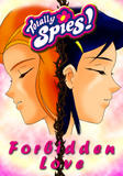
    'Totally Spies: Forbidden Love', a soft-yuri styled story, which I think from the cover you'll be able to see between who:


    Hope y'like

  16. #16
    It took a little time colouring, but here is the first readable page:


    Enjoy...... I hope

  17. #17
    Well, it's another night, another page from my D&Dc fan-Manga:

    Last edited by Zentron; Wed, 01-30-2008 at 09:51 AM.

  18. #18
    Moderator Emeritus masamuneehs's Avatar
    Join Date
    May 2005
    Location
    a fountain pourin' like an avalanche, comin' down the mountain
    Age
    39
    Posts
    3,874
    excellent work on the costumes in this one. if anything, the dialouge is what could be changed. the top panel should probably be "How does... Oh, I see!" and you might want to include exclamation points after he yells out each of the people's "job classes". The dragon spittle and the thief outfit I particularly like

    Humans are different from animals. We must die for a reason. Now is the time for us to regulate ourselves and reclaim our dignity. The one who holds endless potential and displays his strength and kindness to the world. Only mankind has God, a power that allows us to go above and beyond what we are now, a God that we call "possibility".

  19. #19
    Quote Originally Posted by masamuneehs
    excellent work on the costumes in this one. if anything, the dialouge is what could be changed. the top panel should probably be "How does... Oh, I see!" and you might want to include exclamation points after he yells out each of the people's "job classes". The dragon spittle and the thief outfit I particularly like
    Thanks for noting on the dialogue, I'll make changes and repost the page!(most likely just edit my previous post)

    Also glad you like the adaptions I made

  20. #20
    I made the text edits, so now it should read OK.

    Right then, onto the next page:


Posting Permissions

  • You may not post new threads
  • You may not post replies
  • You may not post attachments
  • You may not edit your posts
  •