Page 3 of 4 FirstFirst 1234 LastLast
Results 41 to 60 of 61

Thread: Zen's Art Stuff

  1. #41
    Quote Originally Posted by darkshadow
    Your proportions seem odd somehow o_O, but im tired so i might be seeing things..
    No, you're not seeing things! Clover will be the only one who's proportions are right, the other three... I kinda ran out of paper space, which is why you can't see their feet much, 'cos they have none. 'Tis a small habit of mine, always starting too low on the page

  2. #42
    Banned darkshadow's Avatar
    Join Date
    Apr 2005
    Location
    Phantom Zone
    Age
    39
    Posts
    4,117
    Ahh ok, well then maybe its a good idea too just cut em off the canvas, at least then the proportions are right then.
    -----------------

  3. #43
    Quote Originally Posted by darkshadow
    Ahh ok, well then maybe its a good idea too just cut em off the canvas, at least then the proportions are right then.
    True, but that'll be for a later date

  4. #44
    Another competition entry featuring the TS girls, Halloween styled:


    Maybe I can make this two wins in a row

  5. #45
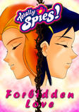
    Yus, another Totally Spies image from me, but it's the start of something new, a Manga/comic.

    'Totally Spies: Forbidden Love', a soft-yuri styled story, which I think from the cover you'll be able to see between who:


    Hope y'like

  6. #46
    It took a little time colouring, but here is the first readable page:


    Enjoy...... I hope

  7. #47
    Well, it's another night, another page from my D&Dc fan-Manga:

    Last edited by Zentron; Wed, 01-30-2008 at 09:51 AM.

  8. #48
    Moderator Emeritus masamuneehs's Avatar
    Join Date
    May 2005
    Location
    a fountain pourin' like an avalanche, comin' down the mountain
    Age
    39
    Posts
    3,874
    excellent work on the costumes in this one. if anything, the dialouge is what could be changed. the top panel should probably be "How does... Oh, I see!" and you might want to include exclamation points after he yells out each of the people's "job classes". The dragon spittle and the thief outfit I particularly like

    Humans are different from animals. We must die for a reason. Now is the time for us to regulate ourselves and reclaim our dignity. The one who holds endless potential and displays his strength and kindness to the world. Only mankind has God, a power that allows us to go above and beyond what we are now, a God that we call "possibility".

  9. #49
    Quote Originally Posted by masamuneehs
    excellent work on the costumes in this one. if anything, the dialouge is what could be changed. the top panel should probably be "How does... Oh, I see!" and you might want to include exclamation points after he yells out each of the people's "job classes". The dragon spittle and the thief outfit I particularly like
    Thanks for noting on the dialogue, I'll make changes and repost the page!(most likely just edit my previous post)

    Also glad you like the adaptions I made

  10. #50
    I made the text edits, so now it should read OK.

    Right then, onto the next page:


  11. #51
    I knew I was neglecting somewhere:


  12. #52
    I've already posted the next page in a previous post, so not much point in doing so again.

    Anywayz, this is to be the last image from my D&Dc fan-Manga that I will display here(or anywhere else for that matter), in wallpaper form:


  13. #53
    Right, well, this is the next page to my Totally Spies fan-comic. *Warning* Contains the 'F' word:


    Hope you like

  14. #54
    Not posted for several weeks?? Oops! I'll try to do better!!

    Though for now, another pic, again another contest entry... a follow-up to my previous beach scene featuring the Totally Spies girls and I did learn from my mistake of last time, with not positioning the characters in a weird place on my paper so I run out of space!

    So then, here it is, 'Totally Beach Spies - Second Day'.... WARNING, contains tasteful semi-nudity:


  15. #55
    Awesome user with default custom title XanBcoo's Avatar
    Join Date
    Feb 2005
    Location
    In my own little world
    Age
    37
    Posts
    5,532
    What the fuck is going on with that middle girl's hand?

    Look how big it is compared to the Redhead's hands. It's in the background, yet it's about twice as large. I know you were trying to go for a foreshortening thing here, but that's not right at all.

    The other two girls look like poseable dolls sitting there in the background. Totally unnatural and weird, especially since the way your D&D comics seem to have avoided this problem.

    <@Terra> he told me this, "man actually meeting terra is so fucking big", and he started crying. Then he bought me hot dogs

  16. #56
    Quote Originally Posted by XanBcoo
    What the fuck is going on with that middle girl's hand?

    Look how big it is compared to the Redhead's hands. It's in the background, yet it's about twice as large. I know you were trying to go for a foreshortening thing here, but that's not right at all.

    The other two girls look like poseable dolls sitting there in the background. Totally unnatural and weird, especially since the way your D&D comics seem to have avoided this problem.
    Heh, it's only a little bit too big, but I didn't have enough time to go and alter it so I decided, what-the-hell. Also in regards to the other two, they're just supposed to be there, it doesn't mater what they're doing, as long as they are there!

  17. #57
    Ever get that feeling that you are forgetting something..... no? Must just be me then

    It's been a while since I was last here, but there was a reason, mainly my computer going kaput and me not backing up my bookmarks, so it was left to my memory as to where I had signed up to.... which is never a good thing, as my memory is rather kack

    Anywayz, I have a few pics to share, I hope you like:


    Zn

  18. #58
    Right, new art again, though one is an 3D experiment of the first:


    Hope you all have your anaglyph red/blue glasses!!

  19. #59
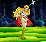
    Right then, here is my latest pi..... oh what's the point:


  20. #60
    Banned darkshadow's Avatar
    Join Date
    Apr 2005
    Location
    Phantom Zone
    Age
    39
    Posts
    4,117
    Looks good, seems you are steadily improving; some points:
    ˇCould use some more shading
    ˇMake the colours softer
    -like this:

    -if you still want to use those hard colours, get rid of those really sharp highlights; like this:

    ˇCompared to her knee, her left foot seems to be turned left a bit too much
    ˇThe sword seems to be going through her hair, that's just odd; the sword should be pushing the hair aside.
    The next 2 points are just to make the overall presentation better:
    ˇThe bg just clashes too much
    ˇHer shadow just comes across as lazy

    You haven't had a reply in a long time, so I hope these points help you .
    -----------------

Posting Permissions

  • You may not post new threads
  • You may not post replies
  • You may not post attachments
  • You may not edit your posts
  •