Wow, great job guys, and just a little bit after I suggested some changes.
@Ryll - I like the second one better, since the great render should be the focal point. The BG complements the render well in that banner. Well done.

Wow, great job guys, and just a little bit after I suggested some changes.
@Ryll - I like the second one better, since the great render should be the focal point. The BG complements the render well in that banner. Well done.
Peace.
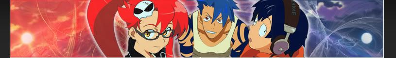
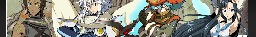
After watching 27 Gurren Lagann episodes in one day i had to make a banner about it
I decided to do something more colorful than i used to, but the thing is that the scanlines absolutely rape it to death so i ditched them this time
I think i'm on the right path but there's still something missing, any thoughts?


I think the main problem is that Kamina looks like a moron.

How about more Yoko, and less of those other guys. Some Kiyoh, Kinon, and Kiyal would be nice too.


if youre gonna take the time to post in here might as well post some nice good quality pictures of the char's you'd like to see used. takes another 5 mins in google maybe... if you need an example of what isn't useable and what is lemme know. but i'd hope anyone with a little sense could figure it out.
been pretty busy lately but since my WoW subscription is over and no funds to bring it back to life im sure i'll get to making a few soon enough.

For popular series like Gurren, you can get loads of high quality fanart, doujin covers, or even homage artwork by other artists off danbooru. That's where I get most of the stuff I'm using. The resolutions are usually very high too. There are image sites were everything comes in high resoultions too, if you want to go overboard.
Ok ok, enough bitching about the render -_- ( i liked it... )
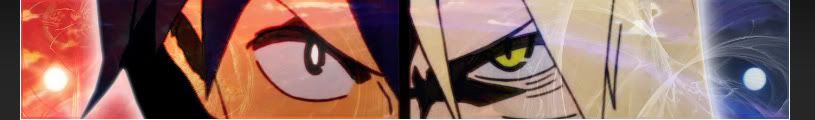
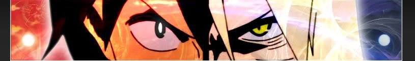
VS.01
VS.02
VS.03
The background here has a double meaning for the render i used, like light and dark side combining forces for a common goal just like the night and the day join in the between
Personally i prefer the second one but you guys tell me what you think.
As you can see from the first line, criticism is encouraged( it rly is )

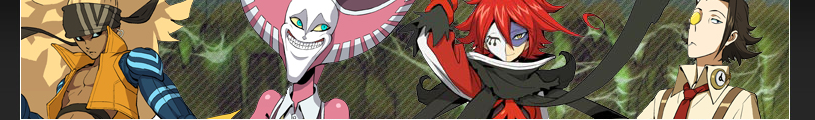
More hack goodness (reposted the 1st one to be together)
Haseo, Alkaid, Atoli and Kite
Albireo, Balmung, Azure Kite and Midori
Tsukasa, Subaru, Tabby and Ovan
Orgel, Posaune, Geist and Fluegel
The renders look good Zell but the background looks blurry and dirty so it doesn't go with them at all
Try using more high quality pics for the bg and go easy on the white stripes
Point taken.
Although sadly good quality dot hack images are hard to find. When I stumbled upon this renders it was as if I had hit jackpot.
The backgrounds are conceptual art from the same game. Yet the blurry effect was supposed to be there, to give the renders the focus, instead of the background. The dirty part I do feel it, but like I said... hard to find good quality dot hack images. It may be popular among some of us... yet not among scanners it seems.
Anyway... when I'm at home I'll try hunting better scans from where I got the backgrounds. Thanks for the pointers Archie.
BTW... white stripes?
You know, the white scalines
Try setting the opacity a little lower
I currently have them at 10% as Lucifus suggested when he posted them.
What level do you recommend (for when Im at home tonight that is...) 5%?
It varies from background to background ( in my opinion anyway )
You can also try to set them to soft light, thats how i did it for the Death The Kid banner
RZ, as you mightve noticed theyre all the sameeee. the renders are nice its kinda a shame you didnt do some other things with the bg's.
Like I said... first time touching Photoshop to do this. I even had to seek google to find HOW to mirror an image :P
haha true well in that case. great job.

I like the second one better. It might do it some good to remove the feathers at the center of the sig, and maybe smooth out the shades of the character render to make it match the blending of the BG more.
Peace.

I like the second one, as well. If you can move Suigintou just to the left a little, it would be perfect. I would also remove the Gotwoot.net at the bottom left. Other than that, they're nice.
I am training in the shadows.
Currently playing: All of your games, probably.
how do I do that? or more precisely.. what exactly do you mean? I made her a bit "darker" because the BG colours are also dark here .. (and tried to remove the feathers and the "Gotwoot.net")maybe smooth out the shades of the character render
what kind of tool should I (or do you) use for smoothing?
looks a bit empty in my opinion but maybe it's just me who thinks so
I can't place the render any further to the left, because the render doesn't "allow" it... her black wing ends exactly at that point
edit
@ below
Ok I guess I'm not skilled enough or it was a mistake that I didn't save a version before I put in the render :/
Or maybe Gimp can't do it the way... I tried to find a tool which makes the render faint a bit into the background but both the smude and blurring tool make it look somewhat weird.
I woudn't mind if someone shows me how they'd do it though
well here are 2 version
the first is mainly the version before just a bit brighter...
seems like here is my limit for the moment, sry :/
if anyone really thinks it's worth improving or wants to use it, then go ahead
as I said I wouldn't mint it if someone shows me what you mean
Last edited by KrayZ33; Thu, 02-05-2009 at 02:13 PM.
 Posting Permissions