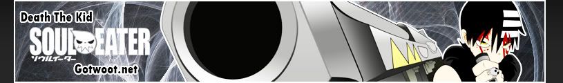
But the over-contrast is what i love about that look
And blurring effects don't sit too well with our fellow admin complich

But the over-contrast is what i love about that look
And blurring effects don't sit too well with our fellow admin complich


true...
well..
the white lines on his left are out of place cause nothing else is that bright. not saying to take it to the other extreme of it being dull, but find a nice middle ground.
just some ideas, if you disagree thats cool too its your shit :P


Ehh, I'm not like adamantly opposed to blurring effects. I just think that it sucks to overuse them.
I made modifications to both them
Made the contrast softer
Eliminated that excess lighting on the left
Positioned the text a bit more to the left
Changed the text
Made the blood and his eyes more realistic, thereby delivering more focus to them
Made the scanlines a bit more transparent as to make the overall banner look more "clean"
Changed the lighting in the background to increase the contrast between the black and the white
both are pro. nice work brotha.
The death the kid one is really good. Just lessen the contrast on kid's face a bit. I kind of cant see his face clearly anymore.
Peace.

I'll see if I can take up any of those requests today. Been rather busy with web development.
Took what was best from both versions and combined them
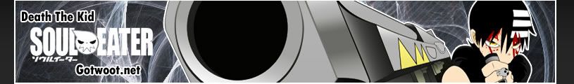
I love it. Great job, especially on how you managed to get the best out of the comments.
Peace.


I don't like the white border around the character, but I like the banner.
The white line around him looks alot better when the banner is in a dark background and you can see the white border around it
guess im not gonna bother making any more banners... sorry i wasted space in here talking.
What the fuck are you talking about?Originally Posted by Kagemane_no_Jutsu
KAGE NEEDS SOME LOVIN EVERY ONCE IN A WHILE
caps lock is cruise control for cool.
but uhhh why isn't my banner useable?
i take it back someone has given me some credit... thanks for the really nice comment, even though its negative rep, whoever you are.
Last edited by Kagemane_no_Jutsu; Thu, 01-29-2009 at 09:01 AM.
First, if your banner was overlooked simply repost it and ask for opinions again. Second, I have no clue why it's not usable (the second one), I haven't seen anyone mention that it isn't, so it may be all in your head. Comp is probably the only guy that can tell you what's good or no good to be added, and since he isn't frequenting the forum as much as he used to you simply have to sit tight and hope he comes around and notices.
Here's his response from your first banner, apply as necessary to what you did to your second one:
Kagemane_no_Jutsu: Interesting, but yer doin it wrong. Matching the borders is a requirement. The diagonal pinstripe thing ... maybe not so much, I dunno.
Last edited by Munsu; Thu, 01-29-2009 at 09:15 AM.
Well for one thing it doesn't have scanlines
On another note, i don't rly like how it lacks color
And don't sulk kage, just get back on the horse and make another one
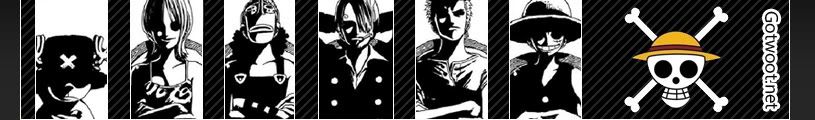
A new One Piece banner, nice and simple
Cleaned it to perfection i think, just not sure if i should leave their flag in color or make it black and white too

I say leave it. I love clean images like that, and the color at the end keeps it from being like a photograph taken in B&W only because people think it makes it more "artsy."
The colored logo makes it more like an exclamation point if that makes any sense at all.
Seriously like that one Arch. Seconded Ryllharu's point.

Keep it as it is man, sometimes less is more
Also do I sense the second coming of Lucifus in you Archie?, you've been doing a lot of photoshopping lately.
"Be sure to take this piece of $#!t(meant sheet)" - My dynamics professor(heavy japanese accent)
Sig and Avatar by Lucifus
Current Games: League of Legends(Fuck, its got me hooked again -_-)
 Posting Permissions