hows this?


hows this?
Last edited by Kagemane_no_Jutsu; Sun, 01-25-2009 at 08:35 PM.


Just place your banner below this layer. This alone will count as the border, just put a background and render in their.
Banner Preset.PSD - Mediafire
I'll upload the scanlines pattern in a lil bit. Just make sure the scanlines are barely noticeable by killing to opacity to about 10%.
Edit: Scanlines:
GW Scanlines - White.PSD - Mediafire
Open that up, select all (CTRL+A), Edit>Define Pattern>GW Scanlines - Save.
It'll now be in your pattern overlays.
Last edited by Lucifus; Mon, 01-26-2009 at 05:59 PM.
Here's something i'm working on
It's not even nearly complete, but it's time for bed right now and i wanted to hear some opinions
Its good.... but scanlines over the entire banner as always makes me not want to like it as much. Try just putting it over the bg and this will hopefully make the render really stand out.
I really do like it. The only change i'd make is to bring the text layers above the C4D.
Simple Render, C4D, and Text. Simplicity is bliss.
Edit: And ya, same as above.
Scanlines are okay, as long as they're not gigantic and set aside like gw's standard. Lower the opacity on that baby pronto.
its bliss if you don't enjoy putting in some time and effort I guess.
Decided to try some more stuff b4 going to sleep
Any thoughts Lucifus?
@Kage: Maybe this is the best some of us can do even after putting in time and effort...

Archie, good work with this one. Big improvement from the Medusa one. The text in your second version looks perfect. The white outline however just ruins it for me. It's just too jarring. I'd say, go back to what you had in your first version, and then selectively delete your scanlines over top of the render, until you get a balance of 'clean' to 'scanny' that suits you.
hell yea^
and if ALL you can do is "simplistic" works then you haven't put in any effort in the trial and error of making other styles visually pleasant. sorry, this is what happens when someone's hard work goes unnoticed and unapreciated time after time.
Well there's no need to diss my work just because you want attention Kage -_-
Especially since i've always liked and praised yours
Final version ( i think )
1
2
Which one do you guys prefer?


Well, since you guys are in banner making mode... I'll just throw some series that are of interest to me to see what you guys can come up with if any are of interest to you:
Casshern Sins
Hajime no Ippo
Gurren Lagann
Toaru Majutsu no Index (no lolis please)
Macross Frontier
Kaiba
Darker than Black
Baccano!
Pumpkin Scissors
Eureka seveN
Kenichi
Seirei no Moribito
Afro Samurai
Hokuto no Ken (Fist of the North Star)
Berserk
Noein
The Third
Kemonozume
Utawarerumono
City Hunter
GTO
Well, have fun.

God damn Bud.Originally Posted by Munsu
I may have too, look at some of those myself to assist in that grand project.
image fail!
I'll take Toaru Majutsu no Index
I'm not sure if i have the skills but i'd love to do something with Touma's "Dragon arm"
ill try a beserk banner...
Arch I wasn't dissing your stuff, it almost always looks great... I was dissing laziness and the fear of branching out in different directions.
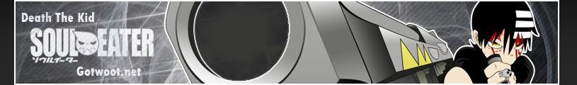
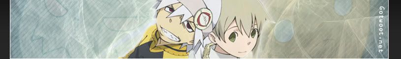
Here's another one about Soul Eater
I messed with a couple different concepts i'm not used to with this one like lighting and exposure but i think it turned out pretty well
I also tried using black scanlines on the left and white ones on the right to make it more interesting ( the whole banner spins around that black and white concept i guess )
Any thoughts?
PS: This doesn't mean i'm done with the first one but i'm still waiting on complich's opinion
It seems a little blurry, but I like the idea behind it.
I am gonna try a Tower of Druaga one later. Maybe I can post them by tomorrow. Maybe I will also do a quick Kannagi one using an old wallpaper idea I used before.
Peace.
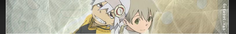
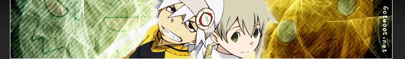
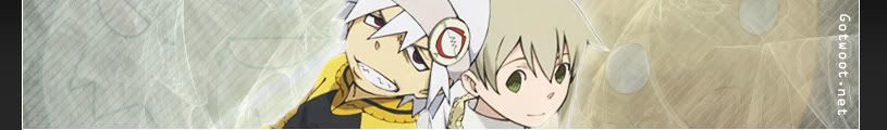
Messed with it a little bit
Any favorites?

first one is cool... I wanted to comment on that banner anyway and suggest that you make the 2 faces on the sides a bit more visible and that's what you did in the first.
I just saw a Afro Samurai one that is added already, so forget about that one from my part.
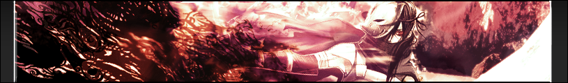
is looking great arch, just two thoughts come to mind;
lower the contrast a little not so much on the renders but on the places that look overcontrasted... the really bright spots that lack any detail.
the fractal background is tight, im feelin it, i think it'd look better and help draw attention to the faces in the BG as well as the focal renders if you blurred the fractal layer in spots where you think needs it. mix it up, but make it flow together.
 Posting Permissions