Page 5 of 6 FirstFirst 123456 LastLast
Results 81 to 100 of 117

Thread: Move your renders to the gallery!

  1. #81
    Graphics Whore Phoenix20578's Avatar
    Join Date
    Aug 2005
    Location
    Jersey
    Age
    36
    Posts
    1,879
    The pen tool is better than Poly-Lasso because it allows you to Easily go back and fix any error that might have been made.

    Feathering just adds a kind of glow to whatever was cut, so is takes a bit off the render, but not enouph to effect how the work will come out.


    For all you awesome people, it's just Phoenix. The numbers are just the amount of times people misspell it.

  2. #82
    Not if you only do it a pixel or two. If you go crazy with it you'll end up with a crap selection though. It is basically used to soften your selection to avoid jagged edges.

  3. #83
    Remnant of Woot Lucifus's Avatar
    Join Date
    Sep 2005
    Location
    Photoshop, Eclipse, Notepad
    Age
    33
    Posts
    1,949
    Sweetness, I'm gonna give this a shoot, Gotta find a decent pic though.
    Don't believe in yourself, believe in me, who believes in you.


  4. #84
    This is just my method so you may not like it. But until you try several different ways you won't find one you like. Good luck!

  5. #85
    Vampiric Minion Kraco's Avatar
    Join Date
    Oct 2005
    Location
    :noitacoL
    Age
    45
    Posts
    17,902
    I have never tried the pen tool for this purpose. It's an interesting idea, though, and seems to be used a lot by people here, and the results are good. However, personally I just use the eraser or brush/mask. That's mainly because I have a Wacom tablet, and I more often than not end up touching the image here and there anyway, fixing minor (or major if needed) things, like originally clipped off parts of the body. Using the eraser is a pain with a mouse, but not with a tablet.

  6. #86
    Moderator Emeritus masamuneehs's Avatar
    Join Date
    May 2005
    Location
    a fountain pourin' like an avalanche, comin' down the mountain
    Age
    38
    Posts
    3,874

    Wink

    Well, I actually use Gimp so there isn't a Pen tool like the one described, but I did manage to create a Path and turn that into a selection. Still needed some erasing afterwards but this is the final result! Still having some trouble with the hair... crazy spiked bastards!


    Oh, and I had to basically recreate the bottom half of the uzi, because it was covered in smoke (some is still left along the leg, but I think that looks sorta cool there) and that was an uber pain in the butt.
    Last edited by masamuneehs; Tue, 03-14-2006 at 10:22 AM.

    Humans are different from animals. We must die for a reason. Now is the time for us to regulate ourselves and reclaim our dignity. The one who holds endless potential and displays his strength and kindness to the world. Only mankind has God, a power that allows us to go above and beyond what we are now, a God that we call "possibility".

  7. #87
    Vampiric Minion Kraco's Avatar
    Join Date
    Oct 2005
    Location
    :noitacoL
    Age
    45
    Posts
    17,902
    That's actually MP5k with the short magazine. Good work with it, though. I personally like enhancing and fixing pictures like that. Perhaps because I don't have the skills to draw them from scratch...

    The fingers of the left hand could use a bit lighter cell shading.

  8. #88
    Moderator Emeritus masamuneehs's Avatar
    Join Date
    May 2005
    Location
    a fountain pourin' like an avalanche, comin' down the mountain
    Age
    38
    Posts
    3,874
    Got another render. This one's from a doujin cover. It was alot easier to do than the last one, but the original quality was also much lower.


    Kraco, I know I'm supposed to care about stuff like the left hand, but since I'm not using it in any of my own stuff I really am not going to go about fixing it that much... The fingers stand out where they are, but they match the rest of the skin tone pretty well
    And, of course after I noticed how poor of a job I did on that hand I went and redid it... Not the skin tone though, just the crummy black edge around it

    Humans are different from animals. We must die for a reason. Now is the time for us to regulate ourselves and reclaim our dignity. The one who holds endless potential and displays his strength and kindness to the world. Only mankind has God, a power that allows us to go above and beyond what we are now, a God that we call "possibility".

  9. #89
    Remnant of Woot Lucifus's Avatar
    Join Date
    Sep 2005
    Location
    Photoshop, Eclipse, Notepad
    Age
    33
    Posts
    1,949
    After my first attempt, I discovered this was a bit harder than I taught it would be...
    Don't believe in yourself, believe in me, who believes in you.


  10. #90
    ANBU Captain Zinobi's Avatar
    Join Date
    Apr 2005
    Location
    wait...what?
    Age
    32
    Posts
    701
    hahaha...man you'll get used to it. then it just takes hella long.

    I'm official.

  11. #91
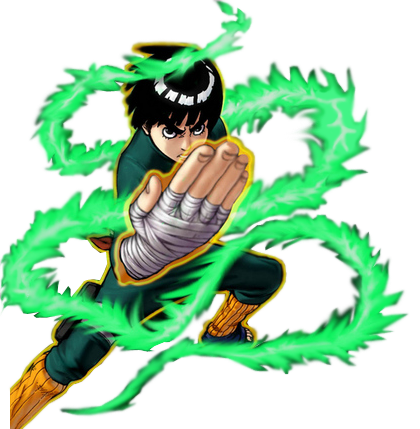
    Here's the Amano Ginji I had to cut out for my Thunder Emperor sig. The hair is not perfect but the imperfections are not visible until you zoom in 600%.


  12. #92


    i had to make some of the green flame myself so it looks a bit weird

  13. #93
    I actually dont think it looks weird at all. Also, I like the glowing you added to the hand.

  14. #94
    Junior Sexfiend PSJ's Avatar
    Join Date
    Jul 2003
    Location
    At a bar
    Age
    35
    Posts
    5,104
    You can see where he made the flame himself but it looks good anyway, barely noticeable.

  15. #95
    Moderator Emeritus NM's Avatar
    Join Date
    Mar 2004
    Age
    36
    Posts
    1,800


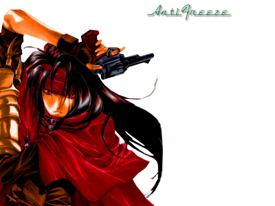
    Neither of these were rendered by me, I found them on a render site and I thought everyone might like a Vincent render .

    @PSJ: In that Bleach sig you made for DB_Hunter, do you have happen to have that image of Rukia? Its the exact same as this Rukia render I posted but she is in white clothing instead of the regular Shinigami colors. I thought that one looked much better and I was hoping you might still have it.
    This fantastic Sousuke sig was made by the one and only Lucifus! Thanks man!

  16. #96
    Junior Sexfiend PSJ's Avatar
    Join Date
    Jul 2003
    Location
    At a bar
    Age
    35
    Posts
    5,104
    Ah sorry man, i didn't do that one. Mine was blue with Rukia's face in the background. Can't remember who did the one with white clothing.

    EDIT:
    Finished that GTO render i announced in the sig/wallpaper thread. Only made one cause the other one wasn't as good as i first thought.

    Last edited by PSJ; Wed, 03-22-2006 at 10:10 AM.

  17. #97
    That one lazy guy. LaZie's Avatar
    Join Date
    Apr 2004
    Location
    Midgar
    Age
    34
    Posts
    1,246
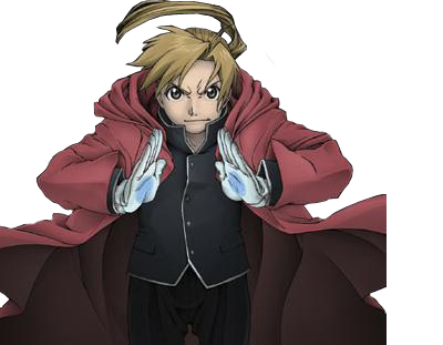
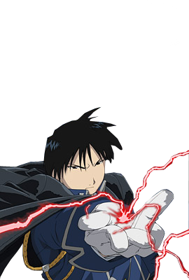
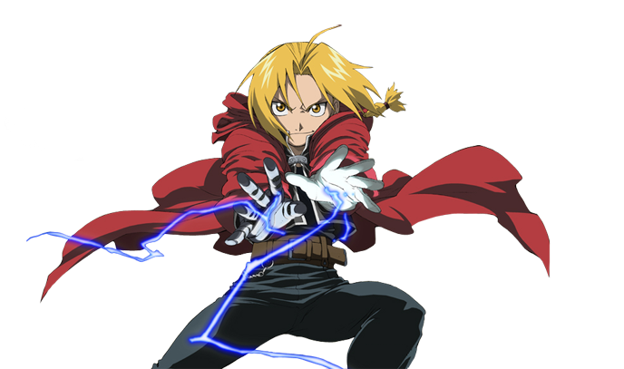
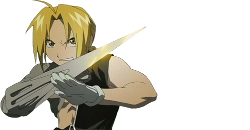
    Couple FMA renders by me


    Last edited by LaZie; Wed, 03-22-2006 at 10:29 AM.

  18. #98
    Graphics Whore Phoenix20578's Avatar
    Join Date
    Aug 2005
    Location
    Jersey
    Age
    36
    Posts
    1,879
    The first and third ones look hot. Good Job Lazy!


    For all you awesome people, it's just Phoenix. The numbers are just the amount of times people misspell it.

  19. #99
    Vampiric Minion Kraco's Avatar
    Join Date
    Oct 2005
    Location
    :noitacoL
    Age
    45
    Posts
    17,902
    I must be totally nuts for spending hours for this, but I wanted to finish it, despite all the trouble:


    It's a composite made from screencaps of a recent episode of Magikano, further edited to replace hair on both sides that was cropped in the video. And there was insane amounts of colour bleeding (red from background). Fixing that, including cell shading, took obviously most of the time.

    Thanks to BoC for posting the Noiseless Sharpening tutorial. That was used to enhance contrast / sharpness in the pic a little.


    A small Momo render/edit (from Shinigami no Ballad) as a bonus here. It looks dull because it was made from the trailer material, which was, to say the least, of terrible quality.


    Edit:
    @PSJ: That's a very nice render. Was the source material really good, or did you enhance it to get so vibrant colours?

    @LaZyKiD: Gotta agree with Phoenix. Although there's nothing wrong with the other two, but obviously in such company they lose some impact factor.
    Last edited by Kraco; Sat, 03-25-2006 at 05:45 AM.

  20. #100
    Junior Sexfiend PSJ's Avatar
    Join Date
    Jul 2003
    Location
    At a bar
    Age
    35
    Posts
    5,104
    I enhanced it to get those colors, but the original pic was very good quality to.

Posting Permissions

  • You may not post new threads
  • You may not post replies
  • You may not post attachments
  • You may not edit your posts
  •